CLS0125 Introduction to Geospatial Humanities
Activity 02: Historic population in Africa, 1850-1950
Understanding quantitative cartography and interpolated sources with historic population data
 |
|---|
| Africa ([1600?]), from Library of Congress Geography and Map Division |
Table of contents
- Introduction and context
- Set up your workspace
- Download the activity data
- Making the data work for you
- Joining your data
- Classification
- Activity deliverables
- Bibliography
What you should submit
Before 6:30pm on Tuesday, 2/20, you should submit to Canvas:
- A document in
pdfordocxformat, answering all the questions that are tagged with, and which are summarized in the activity deliverables section
Introduction and context
This activity will walk you through techniques and best practices associated with representing quantitative geographical data using ArcGIS Pro. You’ll use a pre-processed dataset of population estimates for African countries to visualize population change over the course of a century across the entire African continent.
Major learning objectives include:
- understanding attribute vs. feature data
- making data “GIS friendly” with Microsoft Excel
- spatial processing (dissolving features, merging features, calculating geometry)
- table joins and common identifiers
- classification and normalization
Set up your workspace
At this point, you should be getting pretty good at starting a new project in ArcGIS Pro. Follow these instructions to set up your workspace:
-
First, I recommend creating a directory in your
H: driveforweek04, and inside that directory, make two folders fordataandworkspace. When I do this, it resembles:├─ gisusers$ (H:)/ ├─ week04/ ├─ activity02_africa-historic-pop/ ├─ workspace/ ├─ submission/You should pick a directory structure that makes sense for how you work, but the key thing to bear in mind is to pick a structure that is as futureproof as possible.
To give a concrete example, I like to store my original datasets in a separate
datafolder in case I accidentally corrupt my data and need to get a fresh copy. - Open ArcGIS Pro.
- Sign in with your ArcGIS organization URL.
- Start a new project by clicking Map.
- Name your project something like
activity02_africaHistoricPop. - Save the new project in your
workspacefolder, leaving the “Create a new folder for this project” box checked.
You should now be looking at a fresh ArcGIS Pro project, with the two default layers of a world hillshade and world topo map.
Download the activity data
In this activity, you’ll be working with two kinds of geographic data in this activity: tabular data and feature data.
Tabular data refers to data that is saved in table or spreadsheet format. Commonly you’ll encounter this as an xls or csv file. Tabular data is “geographic” when it contains geographic indicators – such as latitude and longitude or an address – but that doesn’t mean it’s spatial data. In order to display it in a GIS like ArcGIS Pro, there are further steps we need to take. Right now it’s only describing these geographies.
Feature data refers to data that is encoded in a spatial format. Common spatial formats include the shapefile (shp), GeoJSON (geojoson), and geodatabase (gdb). All of these formats contain structured spatial data that can be read inherently by many geographic information systems without any further processing. When you load spatial data into ArcGIS Pro, it is automatically recognized and can be instantly plotted as features on the map; hence, feature data.
Almost always, feature data contains some kind of tabular data as well, usually in the form of an attribute table like the kind you explored extensively in Lab 02.
Tabular data
Download the tabular data on population estimates for African countries between 1850 and 1950, either from the week 4 module in Canvas or by clicking the link below:
The tabular data we’ll be working with is a slightly processed version of this dataset. The author has written (Manning 2010:246) that he composed this dataset:
The findings… draw attention to the widespread assumptions of past observers that African populations were relatively small and that they were growing rapidly—in both colonial and precolonial eras. These pervasive assumptions were more than demographic estimates: they emerged out of ideologies that treated African societies as technically backward, politically immature, and socially elemental. Such views of African societies enabled observers to make aggregate generalizations without exploring the details of African social interaction.
As you’ll see in greater detail next week, counting people is a political action. In this case, the author is counting people (e.g., making demographic estimates across a historical time period) in order to debunk Eurocentric narratives about growth and chance in pre- and post-colonial African societies.
When you encounter a new dataset, your first questions should always be: why does this exist? Where did the data come from? How was it computed? These are important questions to clarify before making a map.
If you want, you can read more about how this dataset was actually created in Appendix A of the original xls spreadsheet: https://doi.org/10.7910/DVN/ZP3PP1
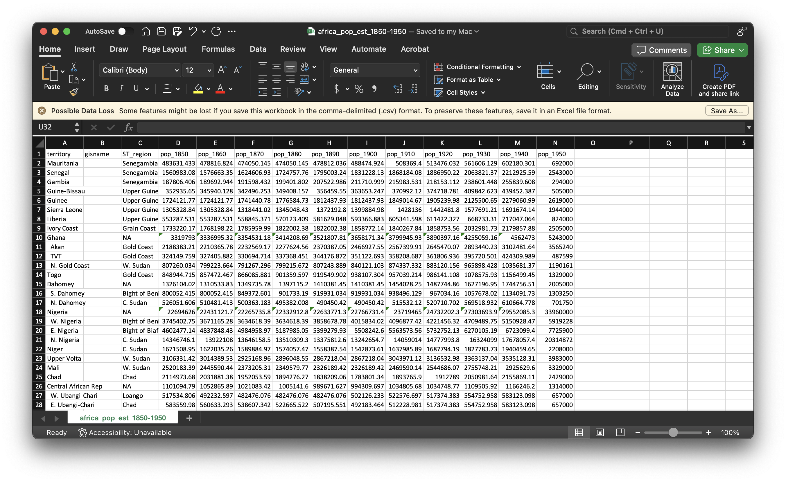
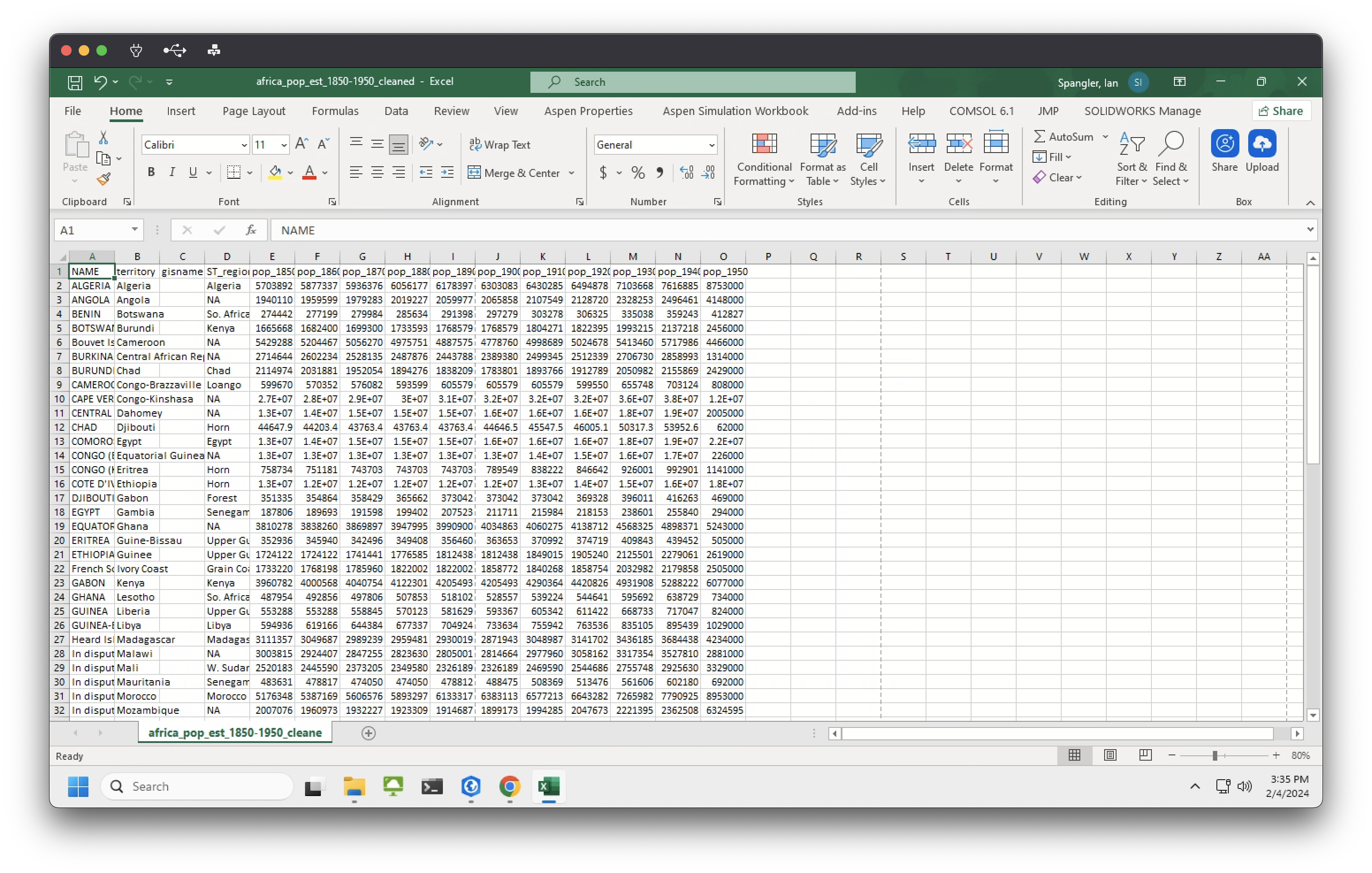
Take a moment to open this dataset in Microsoft Excel. You should see something like:
Feature data
There are lots of places where you could download spatial data of African countries. For this activity, we’ll use Stanford University’s EarthWorks portal, a massive discovery tool for geospatial data. (Alternatives include the Tufts GeoData portal, Harvard’s Dataverse, Princeton’s Maps & Geospatial Data Portal, and the Big Ten Academic Alliance’s Geoportal.)
- Go to EarthWorks
- Search for
africa country boundaries - Click “Detailed World Polygons (LSIB), Africa, 2013” – it should be the first hit
-
Export it as a
shapefile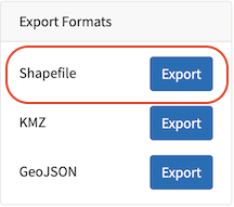
- It will download as a
zipfile. Extract it and move the contents into yourdatafolder - Delete any spurious folders before you load the data into ArcGIS
Load the data
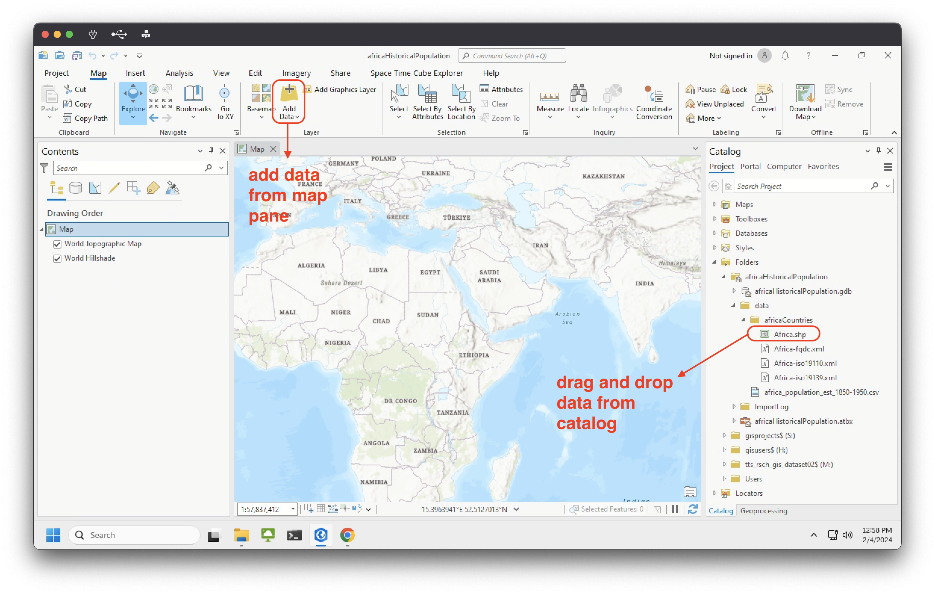
Go ahead and bring the feature data (countries) into ArcGIS Pro, either by:
- Map tab ➡️ “Add Data”
- Catalog pane ➡️ navigate to your
datafolder (or wherever you saved the data) ➡️ drag and drop from Catalog into map/data frame
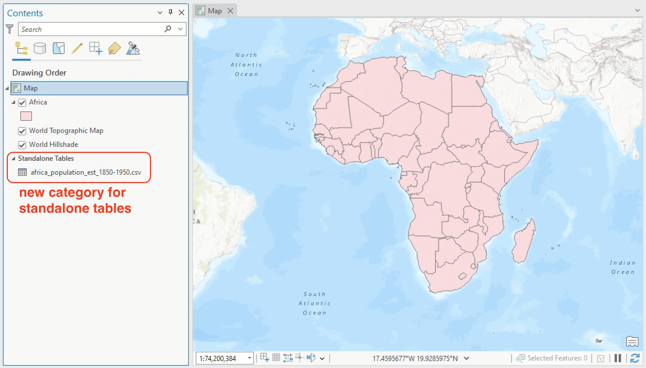
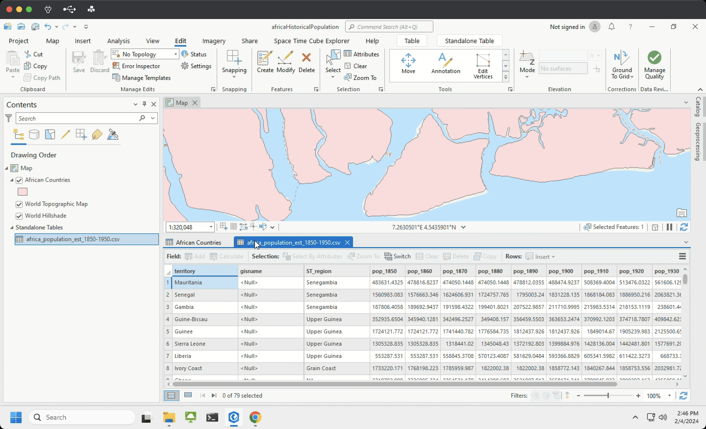
Then, add the tabular data (spreadsheet) using the same method. Once you’re done, you should see both layers displayed in your Contents pane, which will have a new category for “standalone tables”:
Open the africa_pop_est_1850-1950_cleaned file by right-click ➡️ “Open” (or ctrl+T). Some general observations:
- there are 49 records – just a few less than the total number of African countries today (54) – so we can expect the final map to have a few regions of no data
- for now,
gisnamefield is supposed to be empty ST_regionmeans “Slave trade region”pop_columns show decennial population estimates, and they don’t seem to follow changes in historical geographies; rather, they’re all mapped to modern territorial boundaries
Although we understand intuitively how this “standalone table” should be mapped – e.g., we want to associate the values in the pop_ columns with geographic features on the map, based on the country name – that isn’t enough for ArcGIS Pro. A country name is not inherently spatial data: it’s just geographic information.
Turning geographic information into spatial data is one of the most fundamental and powerful aspects of GIS software. Typically, we call the process of connecting tabular data with spatial data a table join – but before we get to that workflow, let’s take a moment to explore our spatial data as well.
Making the data work for you
Even the tidiest datasets will often need further pruning, massaging, and TLC. Our two datasets for this activity are no exception.
Take the countries shapefile, for instance, currently displayed as Africa in your contents pane. Now might be a good time to rename the layer to something like “African Countries,” which I’m going to do.
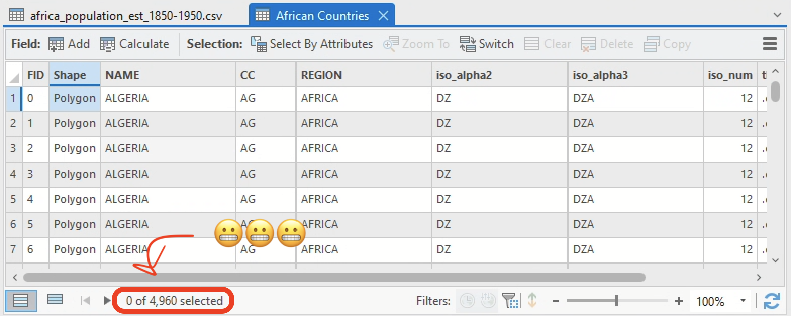
Open the African Countries layer’s attribute table.
Hachi machi! Why, pray tell, are there nearly 5,000 records in this shapefile of African countries?
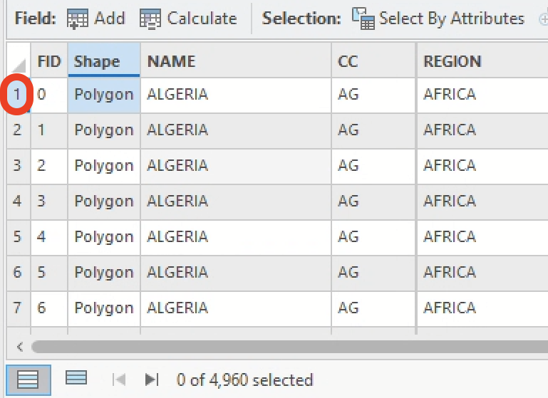
Go ahead and zoom into one of those features by double-clicking on the table row number on the attribute table’s left-hand side…
… and you’ll probably find yourself looking at a tiny polygon off the coast, like this:
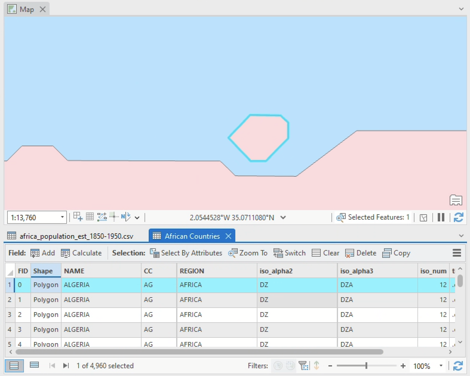
In addition to being pretty heavily generalized, as the jagged edges along the coast indicate, this shapefile appears to have encoded every little island off the coast as a separate record.
There’s nothing wrong with that per se, but for our purposes today, that’s way too detailed: ideally, we just want a shapefile that contains one record for every country in the African continent.
Two methods come to mind for making this data work for you.
Dissolving by field
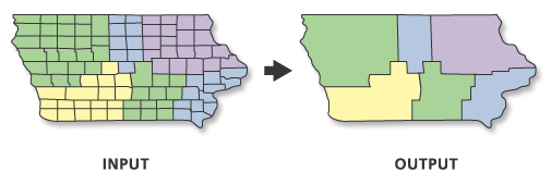
ArcGIS Pro offers a wide range of geoprocessing tools for data management. A classic is Dissolve.
Dissolve aggregates features based on specific attributes. For example, the abstract illustration below consolidates features of like color into a single geometry:
 |
|---|
| Dissolve tool, from Esri |
Let’s make that abstract example more concrete by applying it to the African Countries layer.
-
Open the Dissolve tool by clicking into the Analysis pane ➡️ click Tools
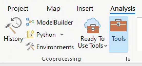
-
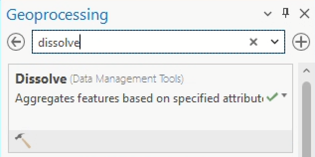
Search for the Dissolve tool by typing “dissolve” into the search bar of the geoprocessing pane that opens. Click Dissolve.
-
Set the tool’s parameters like so…
- Input features =
African Countries - Output feature class =
AfricanCountries_Dissolved– save this toafricanHistoricalPopulation.gdb - Dissolve fields =
NAME Make sure you clear
 any records that might be selected. If you have any records selected, the geoprocessing operation will only be performed on them.
… and click Run.
- Input features =
-
Now you should have a new layer in your contents pane for
AfricanCountries_Dissolved. Open its attribute table – you should now see only 70 records.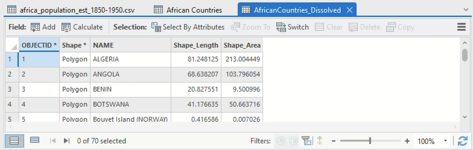
-
Select one of the records and zoom into the coast until you find a few islands. Notice how all the geometries that shared a value in the
NAMEfield have been consolidated even if they’re not touching one another. This is called a multipart feature – or a single feature that contains noncontiguous elements and is represented in the attribute table as one record – and it’s a common result of running the Dissolve tool: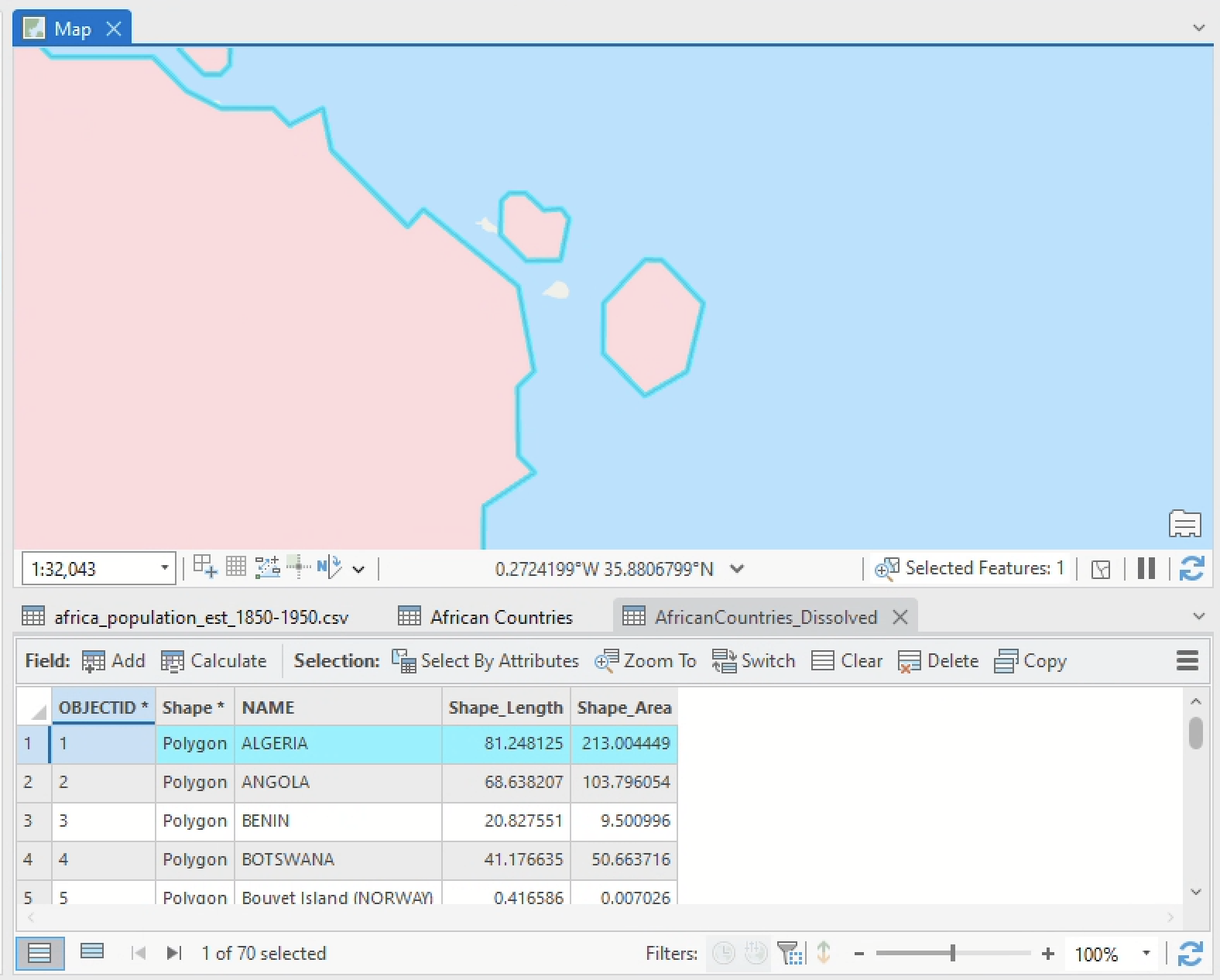
The coast of Algeria as a multipart feature
| 1. There are 54 countries in Africa and our dissolved layer has 70 – still more records than we would expect. Use the attribute table to figure out why that is, and write down an example of a feature that is inflating the feature count. Why does it seem like this feature exists? Do you think you need to keep it for this exercise? |
Deleting spurious geometries with field calculator
The Dissolve tool is a handy way to automate consolidating features, but sometimes it’s important to get a little bit more precise. For example, let’s say we didn’t want to include all those little islands along the coast at all – can we just delete them?
Obviously, you wouldn’t want to pan through the map, selecting and deleting all nearly 5,000 extra geometries by hand. Instead, to delete these features quickly, you’d want to:
- compute their area using the field calculator
- sort the attribute table by that new field
- manually remove features you don’t want
Let’s try…
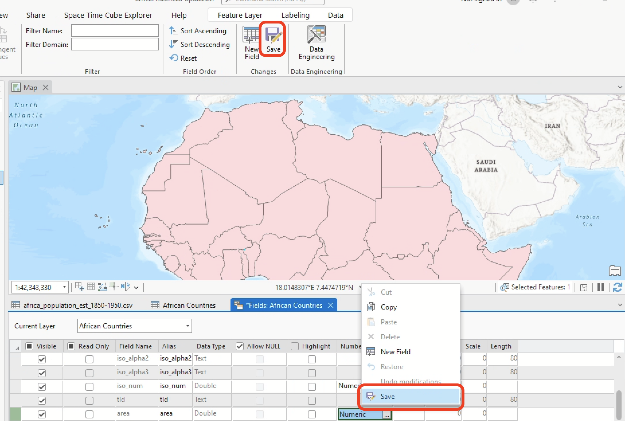
- Close the attribute table for
AfricanCountries_Dissolvedand open the attribute table for your original shapefile,African Countries - Click the “Add” button in the header of the attribute table.
- Fill out the fields so that
- Field Name =
area - Alias =
area - Data Type =
double - Number Format =
Numeric
And save it, either with the Save button in the Fields tab at the top of your screen or by right-clicking in row itself and choosing “Save” (as highlighted below).
Typically, when you are calculating the geometry of any feature or set of features, you’ll want to first ensure it’s projected in a planar coordinate system. If you inspect the source information of our
African Countrieslayer, you’ll note that it is only projected in a geographic coordinate system – not a planar (also known as “projected”) coordinate system. For the sake of brevity in this activity, I’m skipping that step, but it would cause problems later on if we were to continue this analysis. - Field Name =
- Back in the attribute table for
African Countries, right-click thearea➡️ “Calculate Geometry”. This will automatically open the Calculate Geometry geoprocessing tool. Set the parameters to:- Input Features =
African Countries - Field =
area, while Property =Area (geodesic) - Area Unit =
Square kilometers - Coordinate System =
GCS_WGS_1984(you can select this by clicking on the graticule icon next to the box)
- Input Features =
- Click OK and you should see the
areafield populate with a bunch of values. Go ahead and sort those values in descending (highest to lowest) order with right-click ➡️ “Sort Descending”.
2. Scroll through the attribute table and examine the sorted data, double-clicking on record numbers to zoom into different features. Is there a break point after which it seems like you could delete most of the smaller features without erasing any actual countries? Where is that break point, and why did you choose it? Specify it with the record number and FID (e.g., “Record #90, FID 3500.”) |
Any time you are manually deleting data, you run the risk of deleting the wrong thing. When you do, there’s no going back. For example, you could delete small but very important features accidentally – such as islands in Cabo Verde – if you weren’t being careful. Approach any manual data editing with a healthy dose of caution, and always use the “Discard”
button in the Editing tab if you need to roll back edits.
For the purposes of this activity, we’ll proceed with the dissolved layer. Go ahead and remove the African Countries layer from your project and rename AfricanCountries_Dissolved to African Countries…
Merging features
… but one last thing before you proceed.
While most of the tabular data we’ll be working with in this activity maps directly to modern geographical boundaries in Africa, there is one exception: Sudan and South Sudan. We’ll need to merge these two features together in order to properly join the data later on.
To merge these two features:
-
Select them both from the map (hold down the
shiftkey while clicking with the selection tool):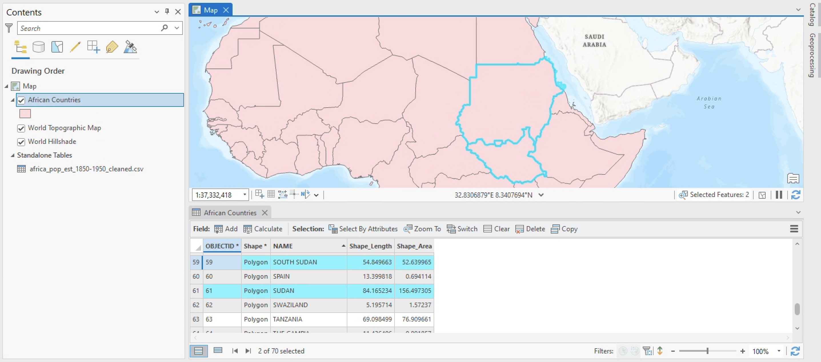
-
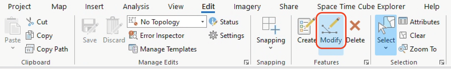
Click the Edit tab and then click the Modify button.
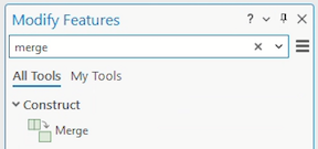
-
The Modify pane should open up on the right-hand side of your screen. Search for “merge” in the toolbar, and a “Merge” function should pop up in the Construct category. Click it.
- With your two features selected, set the parameters so that:
- Layer =
African Countries - Features to merge =
SOUTH SUDANandSUDAN - Under Features to Merge, Click on
SUDAN -
Click Merge
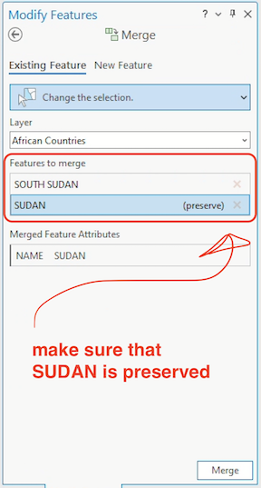
- Layer =
-
Once you’ve merged, you should see something like this:
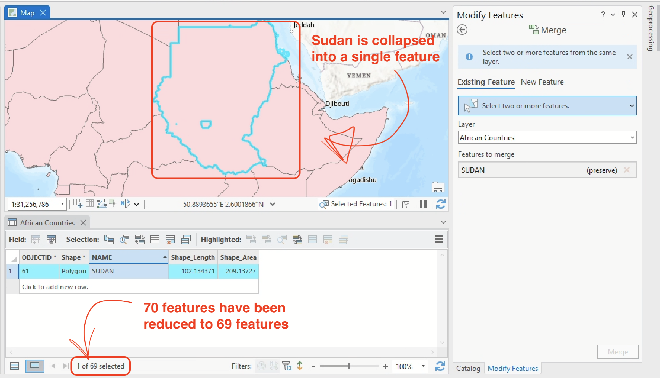
Notice how there’s still a little section of Central Sudan that has been left separate? Using the skill you just learned, merge that feature into the country boundary for Sudan.
Be sure to preserve the features for SUDAN, notIn dispute SOUTH SUDAN/SUDAN.
Joining your data
The table join
The table join is a crucial GIS workflow. Esri describes it as such:
Through a common field, known as a key, you can associate records in one table with records in another table. For example, you can associate a table of parcel ownership information with the parcels layer, because they share a [common] parcel identification field.
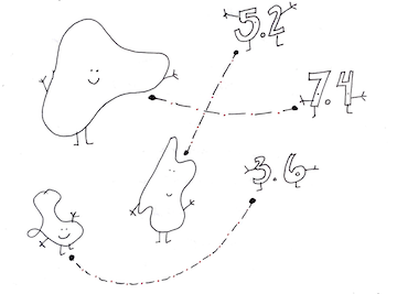 |
|---|
| A drawing showing how attributes (the numbers) and features (the shapes) are joined together. The dotted lines represent the “common field” that links the two data (by Tess McCann, 2021). |
This is precisely what we want to do with our data: we want to join the “standalone table” of population data to the African Countries layer.
Joins only work if the common identifier is exactly the same in both tables: there can be absolutely no differences between the common field’s value in either table, or else the data for that record won’t be joined. For example,
Senegalwould not join toSENEGALbecause the latter is all caps. For this reason, it’s typically ideal to use a numerical key rather than a string (e.g., text-based) key.
Moving forward, the major question is, do we have a common field in our two tables?
Determining a suitable common field
Because we explored the attribute tables earlier, we know there is information for country name in both tables. Let’s find out how suitable those fields would be as a common field.
- Open both attribute tables, one for the
African Countrieslayer and one for your standalone tableafrica_pop_est_1850-1950_cleaned -
Click and drag one of those tables into the side-by-side view (an option for “pinning” the table in various locations should open up once you’re begun to drag it), as shown in the gif below:
- Sort the
NAMEfield in theAfrican Countriestable in alphabetical order, from first to last (you can do this by double-clicking on the field name). Do the same with theterritoryfield in theafrica_pop_est_1850-1950_cleanedtable. - Scroll through, comparing the two fields.
| 3. Why won’t this work as a common field for our table join? |
Building the common field
It looks like we’re going to have to make a common field on our own. Although working with data across a historical time range does make this a little more complicated than normal our goal remains pretty straightforward: we want to populate the gisname field in the africa_pop_est_1850-1950_cleaned tablae with values that conform exactly to the NAME field of the African Countries layer.
This is a pretty simple exercise: all you need to do is make the gisname field say the same thing as the name field of the corresponding country. To accomplish this, I recommend:
- Using Microsoft Excel to copy values from the
territoryfield into thegisnamefield - Reading through the new
gisnamevalues and conforming them to theNAMEfield, correcting any spelling or nomenclature discrepancies
Let’s get started…
- First, open
africa_pop_est_1850-1950_cleanedin Microsoft Excel. (You might need to right-click on the file and select “Open with”…) -
Go back to ArcGIS Pro. Select all the records in your
Africa Countrieslayer and click the Copy button in the header of the attribute table.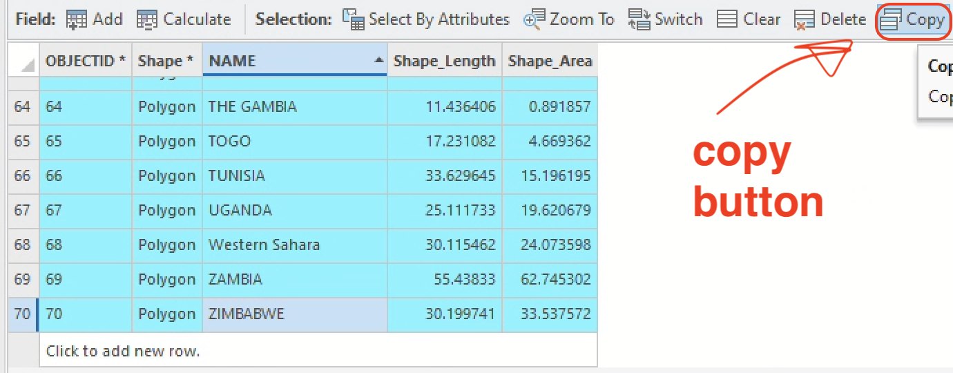
-
Paste the copied values somewhere in your Excel spreadsheet. Here’s where I dumped mine:
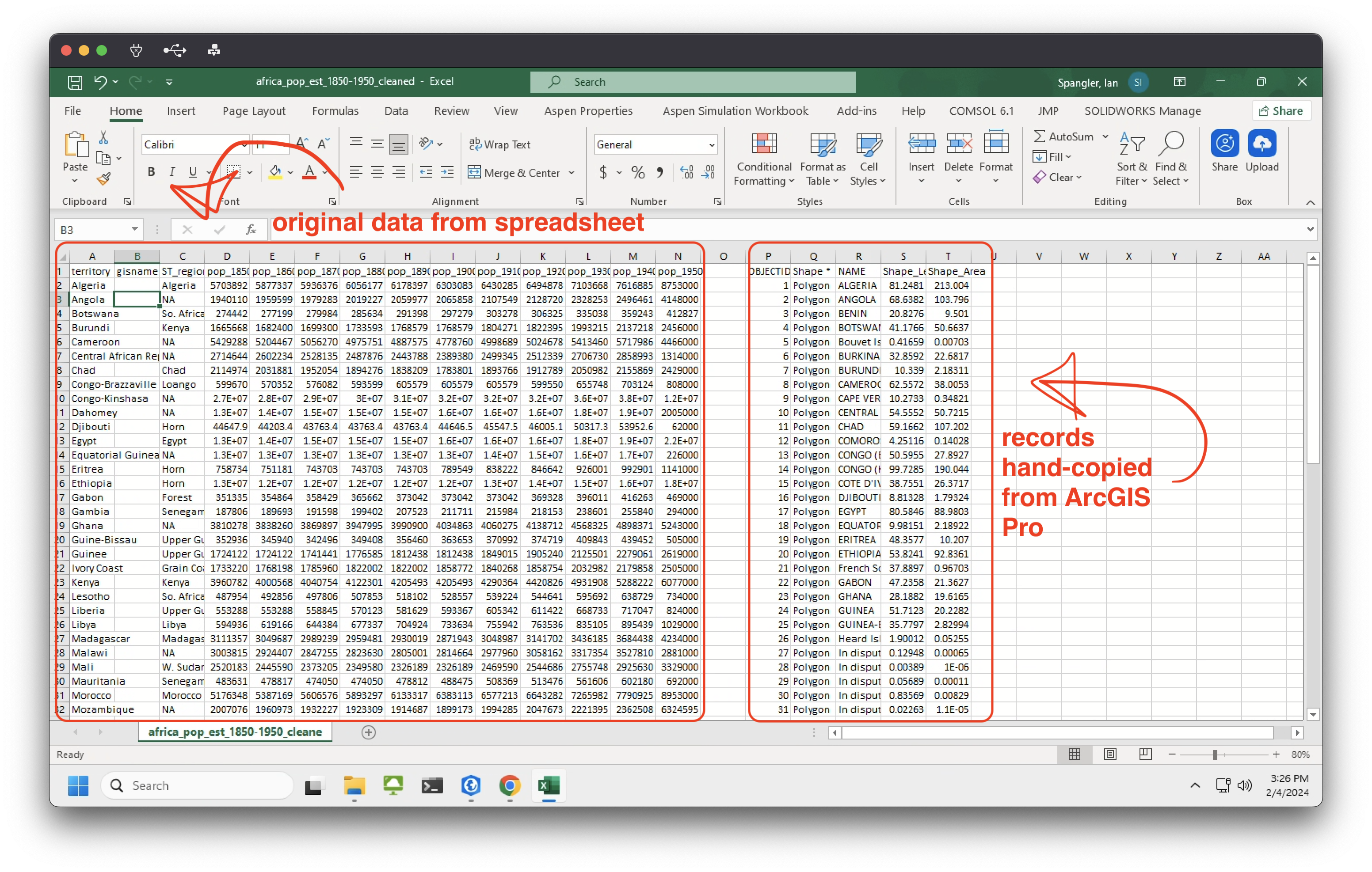
Temporarily, we’re going to start treating our Excel spreadsheet like more of a scratch pad than a data spreadsheet. We’ll move a bunch of things around, with the goal of making the currently empty
gisnamefield conform exactly to theNAMEfield to which we want this data joined. By the time we’re done, it will be fully joinable and GIS friendly. -
Now, right-click on the header above the
NAMEfield, and select “Copy”. That field was in theRcolumn for me, but it might be in a different column for you.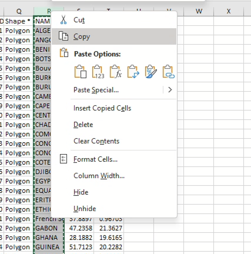
-
Once it’s copied, right-click on your
territoryfield – it should be theAcolumn – and click “Insert copied cells.” This will paste the copied column to the left of the existing data.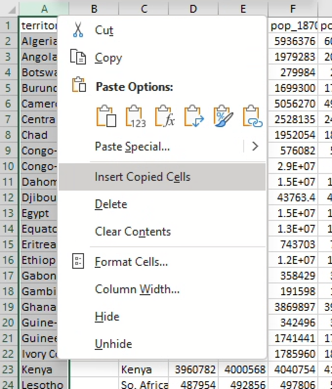
Now you should have a list of the destination field (e.g., the
NAMEfield to which we want to join our spreadsheet data) right next to the input field (e.g., theterritoryfield that we must conform to theNAMEfield before it’s actually joinable).You can delete the leftover cells copied from ArcGIS Pro. Your screen should resemble:
-
Click into the
Q2cell – it should be to the right of your data – and paste the following expression:=UPPER(B2)This expression will paste the value from the
B2cell into theQ2cell, but capitalized. -
Copy the
Q2cell itself by right-clicking on the cell ➡️ “Copy” (orctrl+V) and then paste the contents into cellsQ3:Q50(using either right-click ➡️ “Paste” orctrl+V), as shown in the GIF below: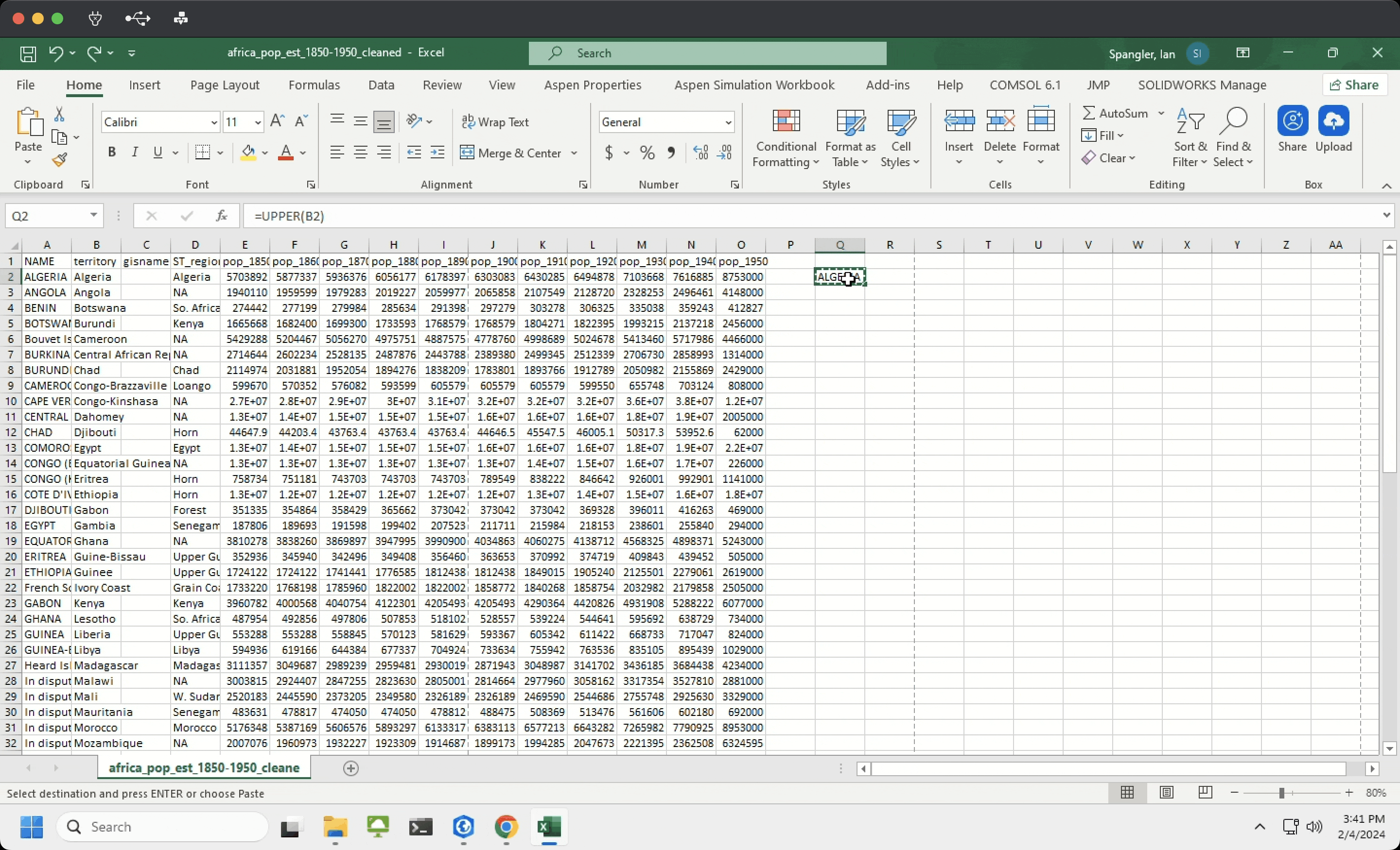
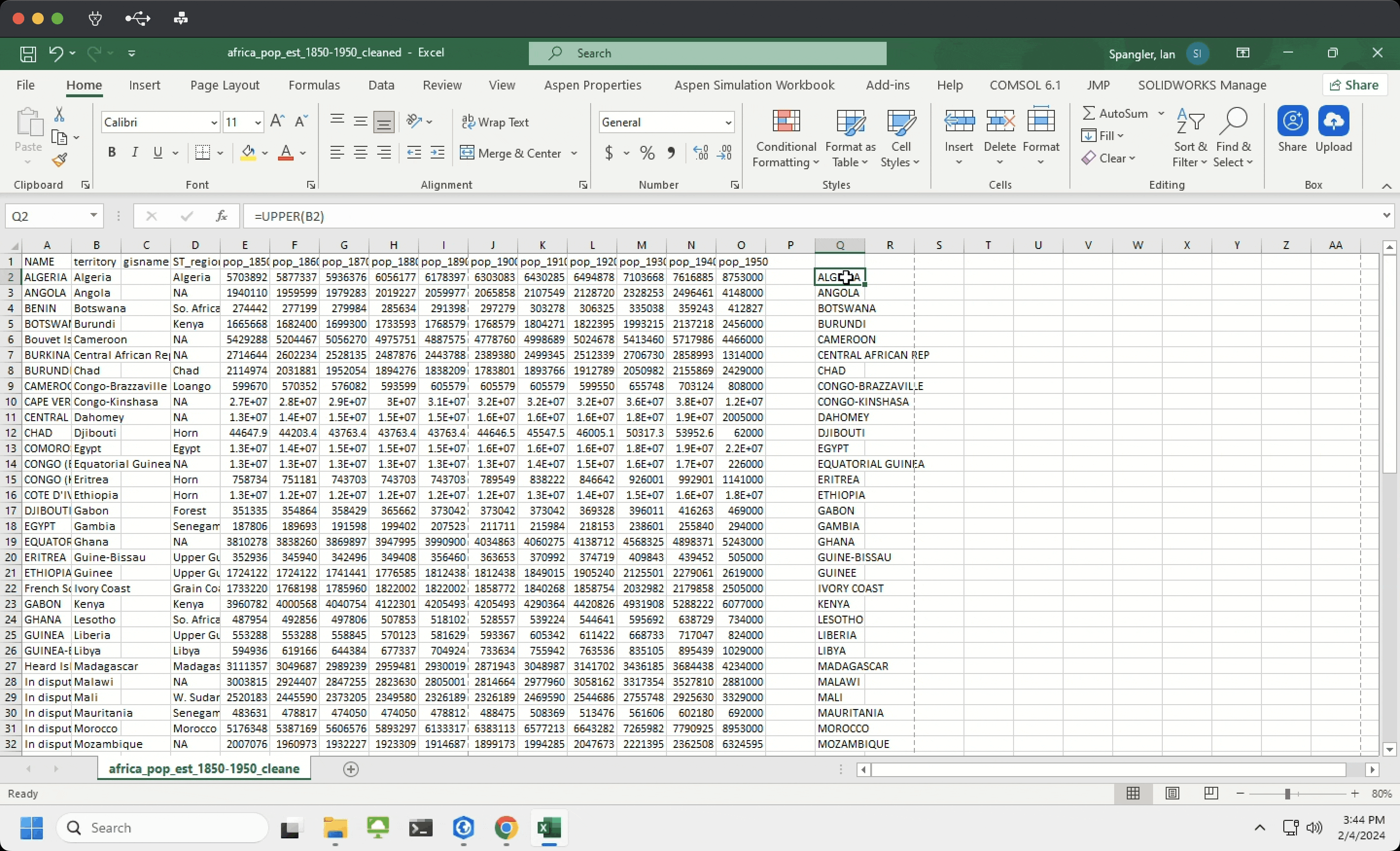
-
Now that you have all your values capitalized, it’s time to paste them where they belong. Copy the new column (cells
Q2:Q50for me) and select the pasting destination: thegisnamefield, columnC, cells2:50.Instead of pasting normally, right-click in the highlighted cells (
C2:C50) and select “Paste Special” ➡️ “Paste Values”. If you don’t choose this option, the formula – e.g.,=UPPER(B2)– will be pasted instead of the values.Again, the GIF below demonstrates:
-
Now, read through every value in the
gisnamecolumn and compare it to its corresponding value in theNAMEcolumn to ensure thatgisnameis exactly the same asNAME. If the two values differ, updategisnameto match the value inNAME.To make this even a little easier, you could cut the
NAMEcolumn and insert it to the left of thegisnamecolumn like so: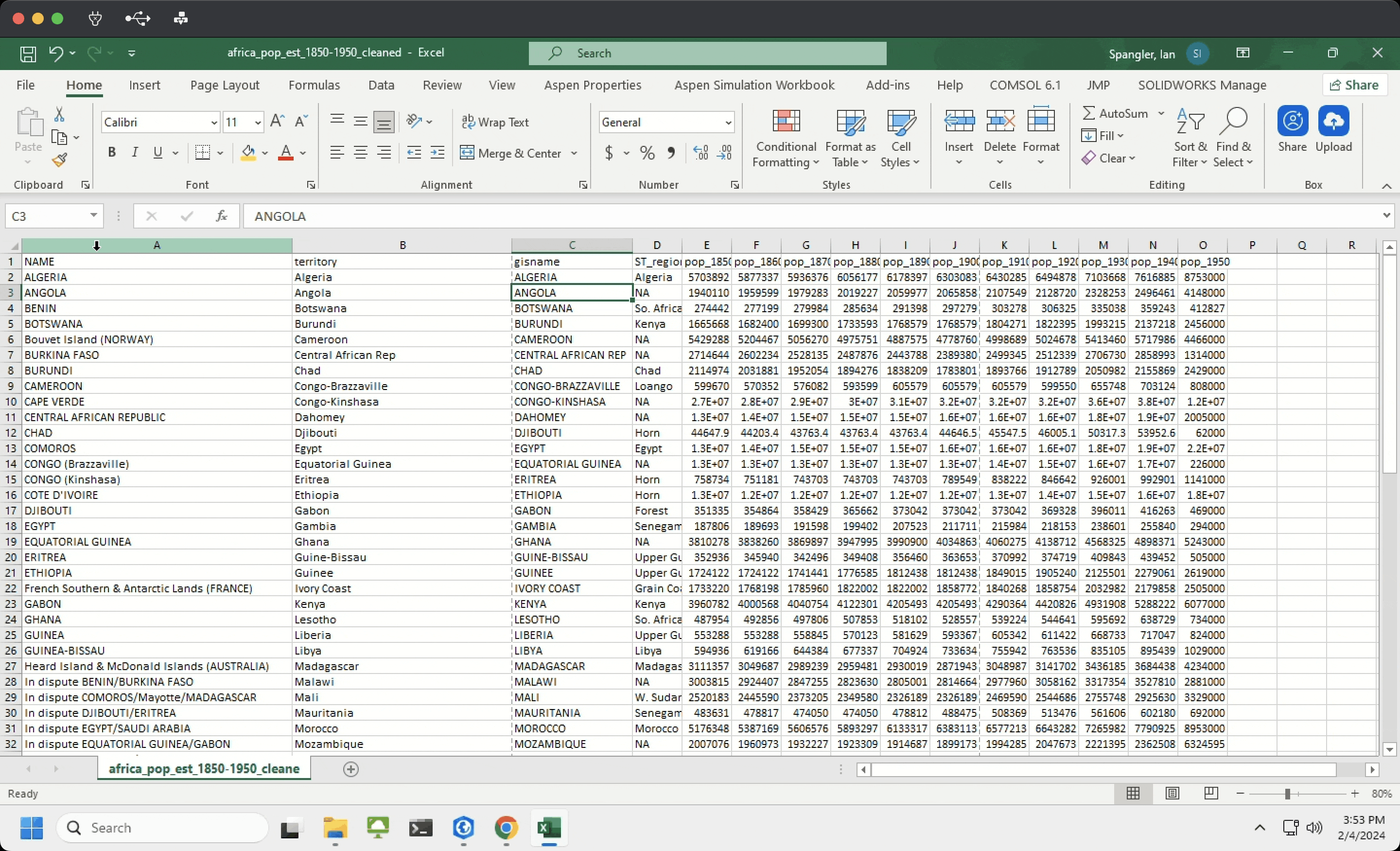
Lastly, a couple of important notes on nomenclature for data from the spreadsheet:
- “Dahomey” refers to modern-day Benin
- “Tanganyika” refers to modern-day Tanzania
- “Spanish Sahara” refers to modern-day Western Sahara
- “Upper Volta” refers to modern-day Burkina Faso
- “Ivory Coast” refers to Cote D’Ivoire
- Pay attention to Guinea, Guinea-Bissau, and Equatorial Guinea – three different countries, and Guinea-Bissau has some spelling differences
- Pay attention to Gambia, which is named
THE GAMBIAin theAfrican Countriestable - Bear in mind that some islands that are present in the
African Countriesdata (like Cape Verde) aren’t present in theafrica_pop_est_1850-1950_cleanedtable – that’s okay
Do not change any of the NAMEcolumn values – they are simply reference cells for theAfrican Countrieslayer. Only change values in thegisnamecolumn. -
Once you’re done, you can delete the
NAMEcolumn from your spreadsheet. The final product should resemble: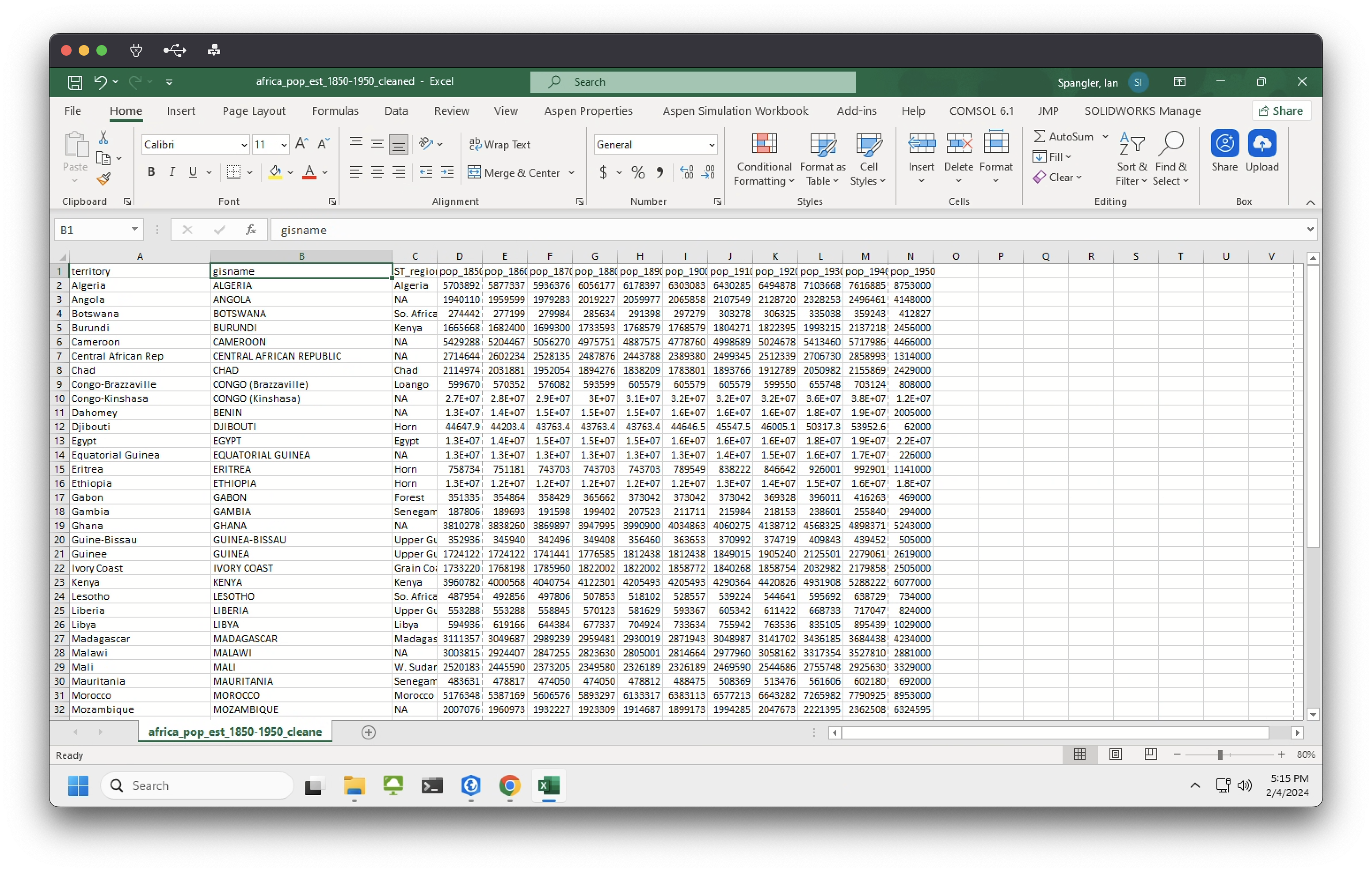
Complete the join
To complete the join, open ArcGIS Pro and…
- Remove
africa_pop_est_1850-1950_cleanedand re-add it from the catalog, just to make sure our latest changes are reflected in the file path that ArcGIS Pro is reading -
We want to join the standalone table
africa_pop_est_1850-1950_cleanedto theAfrican CountriesRight-click on theAfrican Countrieslayer ➡️ “Joins and Relates” ➡️ “Add Join”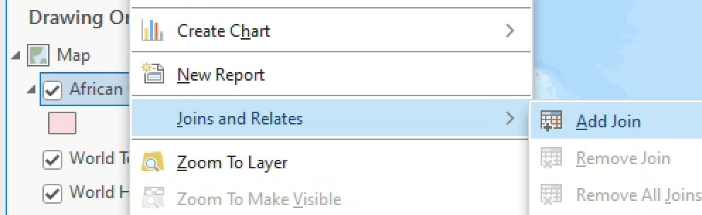
-
When you click “Add Join,” a new dialog box will open up. Fill it out like so:
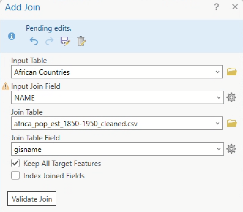
-
Click Validate Join. This prints a dialog that shows how many records will be joined. Towards the bottom of that box, you should be able to find something like this message:
 Checking for join cardinality (1:1 or 1:m joins)...
 A one - to - one join has matched 49 records.
Nice – it sounds like all 49 records from the data should join successfully!
That word cardinality, by the way, is describing the nature of the relationship between the input and join tables. Cardinality can be one-to-one (1:1), in which one record in one table is associated with a single record in the other table, or one-to-many (1:m), in which one record in one table is associated with multiple records in the other table. You can also have many-to-many (m:m) cardinality, which 🥵. We don’t need to dive deeply into cardinality today, but it’s good to be familiar with the term. What is the cardinality of this join?
Anyhoo: let’s click OK to process the join.
-
If you open the attribute table for the
African Countrieslayer, you should now see a bunch of new fields from our join table – woohoo and congratulations! You’ve just successfully completed a table join, by using a common identifier (country name) to attach tabular attribute data (e.g., decennial population estimates) to spatial feature data (African country boundaries).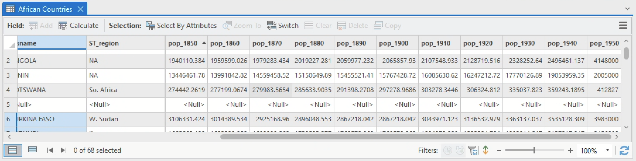
Some of the records have values of
<Null>, which is okay – it just means there was no joinable data for that record.
|
… and you’ll notice that all the fields you just joined are prefixed with
africa_pop_est_1850-1950_cleaned.csv.– in other words, the name of thecsvthat you joined to theAfrican Countrieslayer. | In order to actually save the data, you’ll need to export theAfrican Countrieslayer as a new feature layer (like you did with some of the data in Lab 02). | Do so by right-clicking the layer ➡️ “Data” ➡️ “Export Features”. Name the output file something likeAfricanCountries_Joined. And please, don’t skip this step. It will make your life harder in about 15 minutes. There are geospatial workflows you can’t run on table-joined data layers, such as calculating area, which we’re about to do. | In the Export Features dialog, you’ll also want to unfold the Fields tab and check the box for “Use Field Alias as Name” – this will ensure your field names do not contain the entirecsvfilename as a prefix.
In the next section, we’ll discuss not just how to classify this data, but how classification operates more generally as a powerful tool for getting your message across.
Classification
In Lab 02, you learned about symbology: the set of ArcGIS Pro tools that let you style your data with different colors, shapes, and sizes.
Any time you symbolize data, you are implicitly breaking it up into different representational classes (also sometimes called bins or buckets). The techniques for dividing those classes from one another are called data classification.
Side-by-side comparisons
Start by displaying population for the year 1850 as graduated symbols (refer to the graduated symbols section of Lab 2 or the ArcGIS Pro documentation if you don’t remember how).
You should end up with something like this:
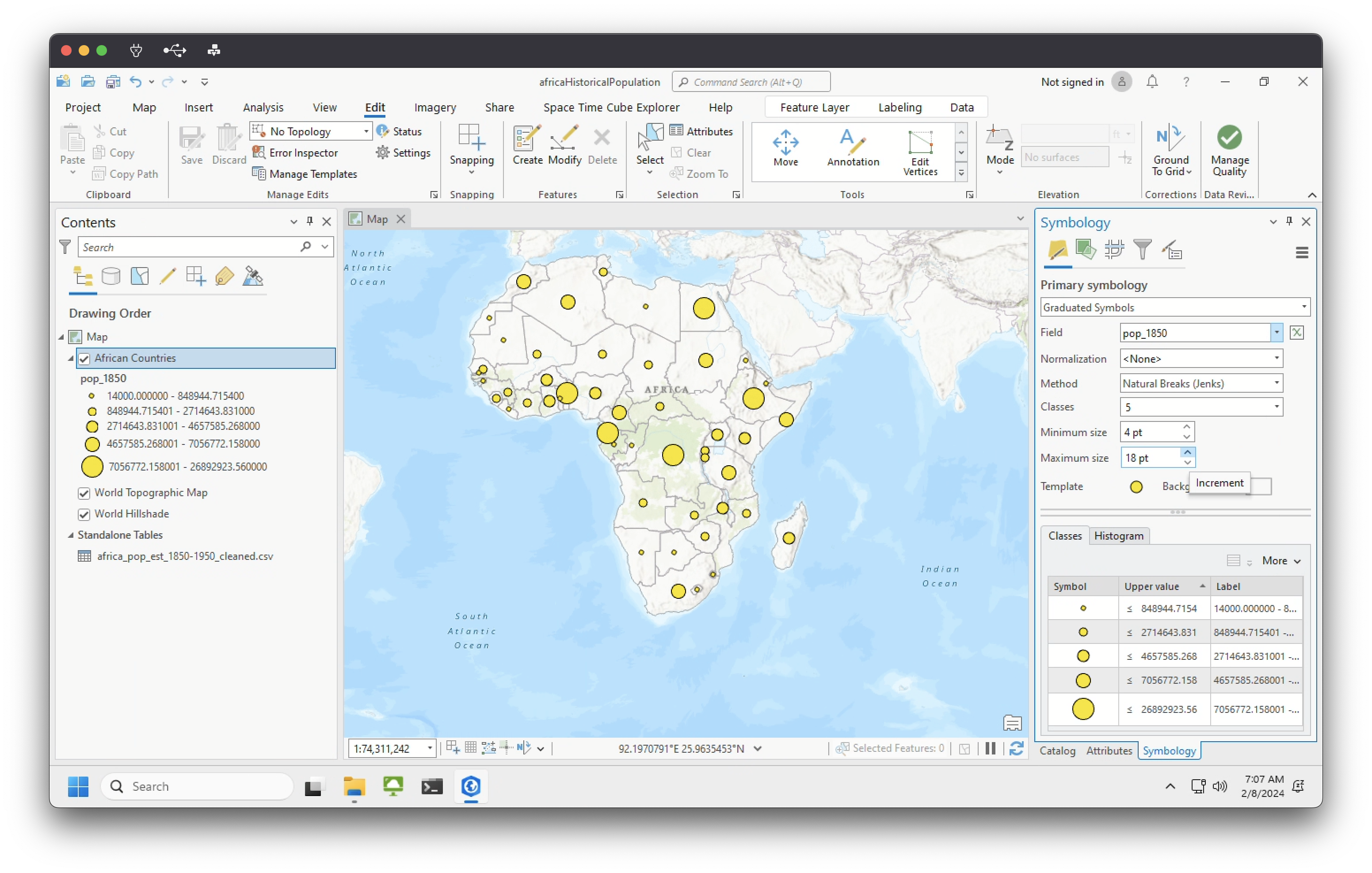
Try toggling the minimum and maximum symbol sizes until it feels right to you.
Now let’s compare this map side-by-side with a representation of the same data in choropleth form.
Even if you don’t know/remember what a choropleth map is, you’ve seen one before. Its name derives from Greek: “bounded space (χώρη or chôra) over which a mass or throng (plethos) is extended” (Crampton 2009:27). Put plainly, “choropleth” means “quantity by area” – and that’s exactly what your choropleth map will show.
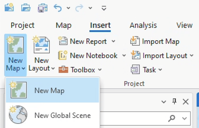
-
On the ribbon, click the Insert tab. In the Project group, click the New Map drop-down arrow:
- This will open another map view – probably named
Map2– in a new tab. - Click on the
Map2tab and drag it so that it’s set in a side-by-side view, like so: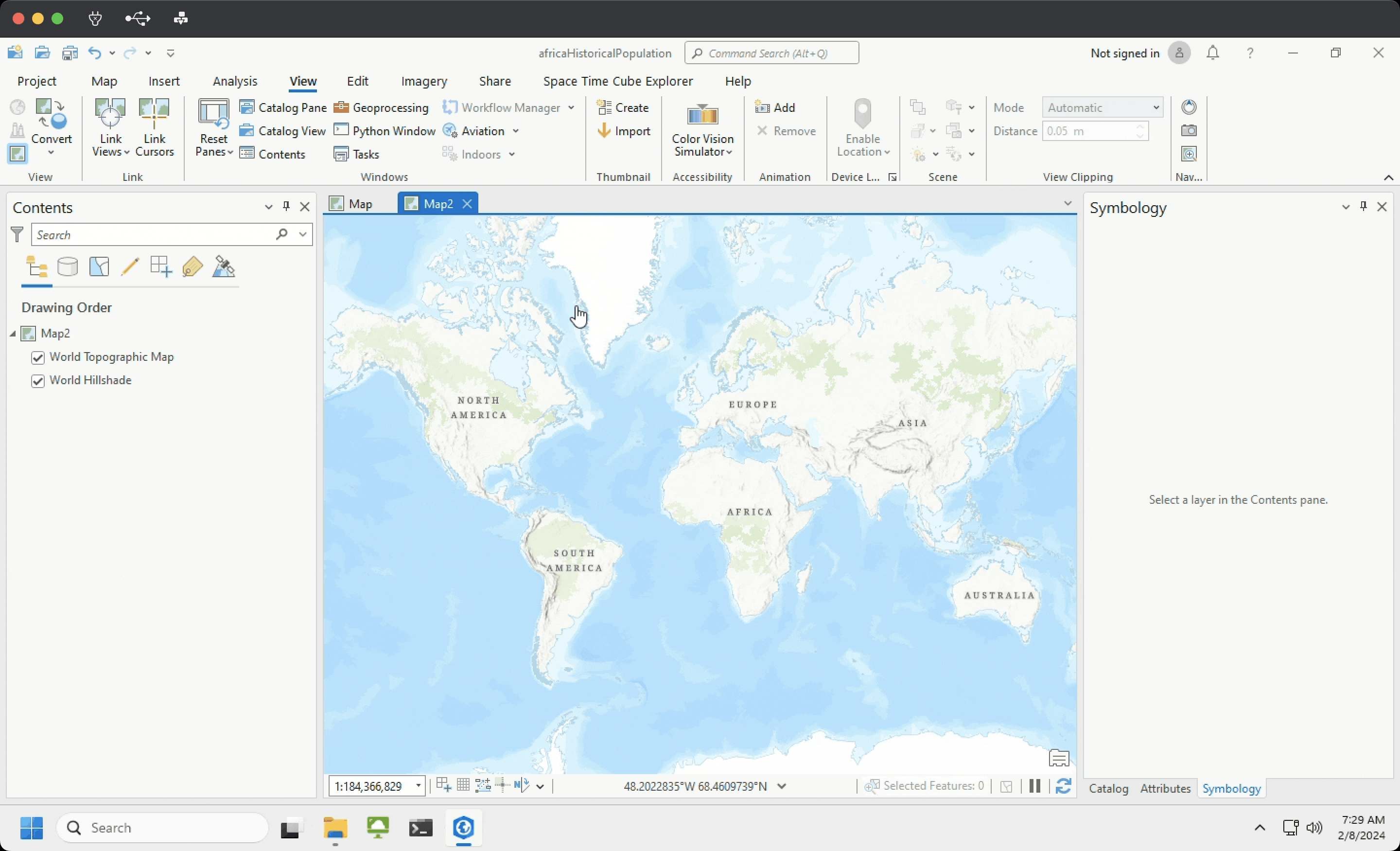
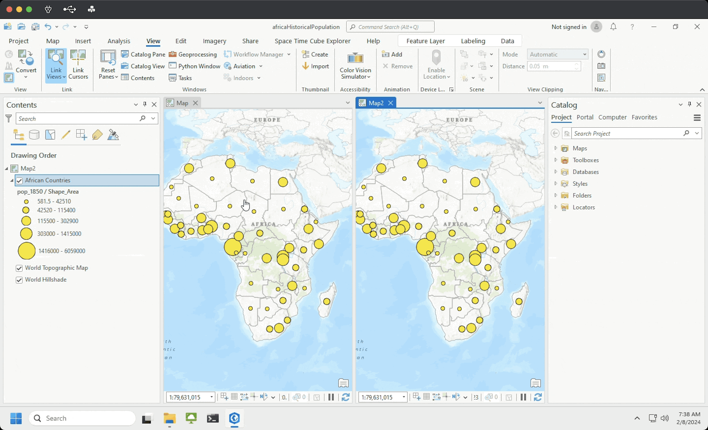
- Drag your
AfricanCountries_Joineddata layer from the contents pane ofMapinto the data frame ofMap2. This will copy the data layer so that it appears in both map views. - Finally, link these two views by following the instructions on this page, under “Steps to link multiple views.” Once you’re done, you should see both maps, side-by-side and connected:
- In the
Map2pane, update the symbology so that you are using a “Graduated color” style instead of a “Graduated symbols” style. Make sure that the “Field” parameter is set topop_1850. Pick an appropriate color scheme (e.g., a sequential color scheme), and you should see something like this: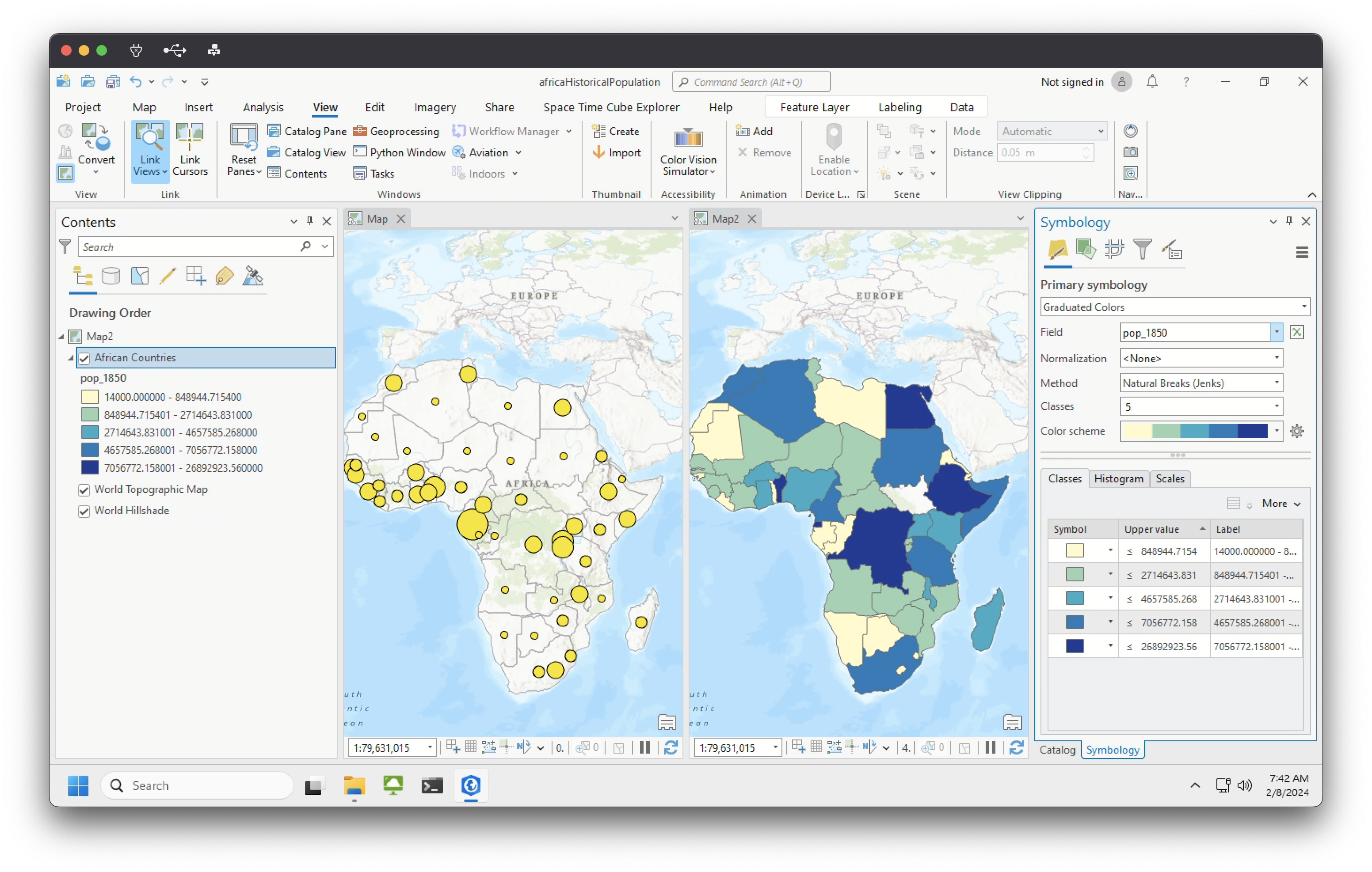
| 4. Take a moment to compare the two representational techniques: graduated symbols vs. graduated colors. Which symbology type feels better more intuitive for representing this data? Why? |
Once you’ve answered this question, you can exit the Map tab, keeping only the choropleth map open.
Classification intervals
In the symbology tab of your AfricanCountries_Joined layer, click the “Method” drop down and note the different options that you can select for representing your data. You can read about classification schemes in greater detail in this excellent post from Axis Maps. The table below breaks down four major schemes that you’ll commonly encounter and the contexts in which they should be used:
| Method | Description | Problems | Use case |
|---|---|---|---|
| Natural Breaks (Jenks) | Minimize difference within classes and maximize differences between them. | Class ranges are always specific to that data | Unevenly distributed data |
| Quantile (or Quintile) | Places an equal number of observations into each class. | Class ranges can have major size variation | Emphasizing relative positions of data values |
| Equal Interval | Divides the data into equal size classes. | Class ranges are static | Evenly distributed data & comparisons of data across time |
| Standard Deviation | Adds and subtracts standard deviation from the mean of the data. | Only works for normally distributed data | Data with normal distribution |
Now open the histogram for the field pop_1850 (right-click the field name ➡️ “Statistics”). You should see something like this:
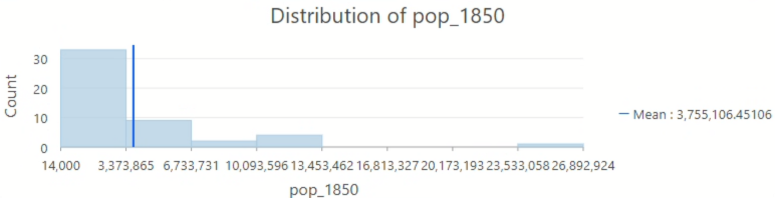
The histogram gives us a glimpse into how the data is distributed. Understanding this empowers us to analyze and represent it. Consider:
- Is the data normally distributed (e.g., bell curve)? Try checking the “Show Normal distribution” button.
- Are there obvious break points into which you could separate the data into different “bins?”
- Are there outliers?
- Where do the mean and median land?
- What happens to the data as you split it into more bins?
| 5. Based on your reading of the data (and in no more than 3 sentences), pick one representational technique that you think fits this dataset best. What are its benefits and drawbacks? |
Data normalization
No matter what classification scheme you chose, you’re looking at data that is not normalized; that is, data that hasn’t been adjusted to transform raw counts into ratios.
Because raw counts can be really misleading, normalizing data is a critical part of any mapmaking endeavor. (You might also hear normalization referred to as “standardization” – they can be used interchangeably, but note that normalization in the geospatial context should not be confused with statistical normalization.)
Normalization requires two inputs: a numerator (the attribute value for feature x) and a denominator (the value by which you want to standardize feature x).
The numerator should always be the property you want to display on your map, but there are a few choices when it comes to denominator…
- By area
- By total
- By another attribute
- By time
… or put another way:
| Denominator type | Expression |
|---|---|
| By area | (Attribute a for feature x / Area of attributes in all features) = Density of a in x |
| By total | (Attribute a for feature x / Total of attributes in all features) = % of total of a in x |
| By another attribute | (Attribute a for feature x / Attribute b for feature x) = % of a by b for x |
| By time | (Attribute a at time ø for feature x / Attribute a at time ∆ for feature x ) = % change of a between ø and ∆ in feature x |
ArcGIS Pro has a handy parameter in the symbology pane that allows you to set a value for normalization:
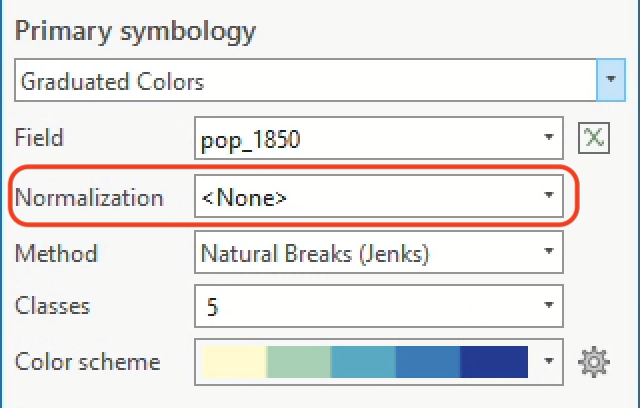
Let’s try that out for a few of these: area, total, and time (in this dataset, there’s not really another meaningful attribute [e.g., gender] by which to normalize the population data).
Calculate area
Normalizing by area will allow us to make a map that shows population density, e.g., people by square miles, square kilometers, etc.
If you open the attribute table for AfricanCountries_Joined, you’ll notice that we already have a field for area. However, the values in it don’t make a lot of sense (at least to me)…
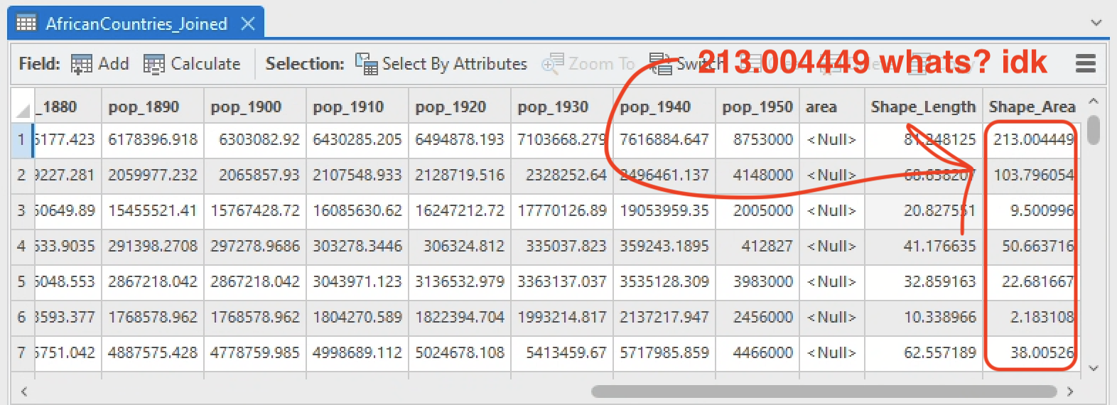
… so let’s compute a new one. You’ve done this before – for this very activity, in fact! – so if an area field is not already present in your attribute table, go ahead and follow the instructions from earlier to create one.
You should set “property” to Area (geodesic) and “Area Unit” to square kilometers.
Once you have this new field, you should see values like this:
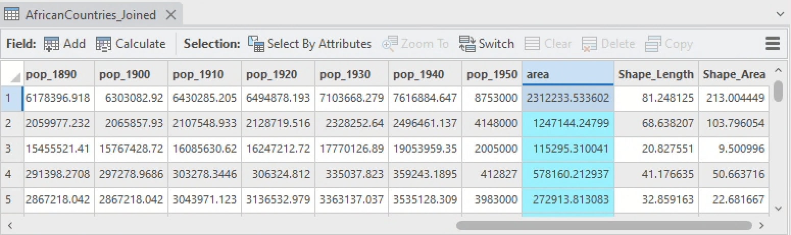
It kind of looks like that Shape_Area field is ~1/10,000 of the actual area in square kilometers, doesn’t it? Weird. Anyhoo. Here’s the easy (and final) part.
Normalize by area, total, and time
In the symbology pane:
- Set “Normalization” to
area - Toggle between a few different fields (e.g.,
pop_1860,pop_1920) - Toggle between a few different “Methods” (e.g.,
Natural breaks,Quantile,Equal interval) - Repeat steps 1-3 to normalize the data by total (“Normalization” =
<percentage of total>) and time (“Normalization” = some other population timestamp field)
| 6. In 2-3 sentences, reflect on the differences between the normalization techniques. What does each one highlight and what does each one obscure? |
🎉 That’s it! 🎉
Activity deliverables
Before 6:30pm on Tuesday, 2/20, you should submit to Canvas a document in pdf or docx format, answering all the questions that are tagged with and which are summarized below:
| 1. There are 54 countries in Africa and our dissolved layer has 70 – still more records than we would expect. Use the attribute table to figure out why that is, and write down an example of a feature that is inflating the feature count. Why does it seem like this feature exists? Do you think you need to keep it for this exercise? |
2. Scroll through the attribute table and examine the sorted data, double-clicking on record numbers to zoom into different features. Is there a break point after which it seems like you could delete most of the smaller features without erasing any actual countries? Where is that break point, and why did you choose it? Specify it with the record number and FID (e.g., “Record #90, FID 3500.”) |
| 3. Why won’t this work as a common field for our table join? |
| 4. Take a moment to compare the two representational techniques: graduated symbols vs. graduated colors. Which symbology type feels better more intuitive for representing this data? Why? |
| 5. Based on your reading of the data (and in no more than 3 sentences), pick one representational technique that you think fits this dataset best. What are its benefits and drawbacks? |
| 6. In 2-3 sentences, reflect on the differences between the normalization techniques. What does each one highlight and what does each one obscure? |
Bibliography
Crampton, Jeremy. 2009. “Rethinking Maps and Identity: Choropleths, Clines, and Biopolitics.” In Rethinking Maps, Routledge.
Manning, Patrick. 2010. “African Population: Projections, 1850-1960.” In The demographics of empire: the colonial order and the creation of knowledge. Accessed February 4, 2024. https://muse.jhu.edu/chapter/242195.