CLS0125 Introduction to Geospatial Humanities
Exercise 01: Learning ArcGIS Basics
Creating a map with ArcGIS Pro with data from India
Written by Barbara Parmenter, updated by Annie Nguyen on September 9, 2019 for ArcGIS Pro 2.3, updated for ArcGIS Pro 3.1.3 Sumeeta Srinivasan Sep 2023, updated by Ian Spangler Dec 2023
Table of Contents
- Introduction
- Creating a Map with ArcGIS Pro
- Starting ArcGIS Pro and Creating a Project File
- Opening Catalog, and adding data layers
- Getting Around the Map Menu
- Setting a Coordinate System for the Map Frame
- Defining the General and Symbology Properties for a Layer
- Selecting and Mapping the Largest Cities in India (optional)
- Selecting Towns by their location relative to Railroads (optional)
- Labeling a Layer Based on an Attribute Field
- Changing the Formatting of Labels
- Using Data from ArcGIS Online (optional)
- Measuring Distance and Area and Drawing a Map to Scale
- Creating a Layout for Printing or Graphic Export
-
Deliverables
Introduction
This tutorial shows you how to use the ArcGIS Pro module to create a simple map. ArcGIS Pro is one of the modules in ArcGIS Desktop. You use ArcGIS Pro to create maps, query data, perform analysis, and most of the other basic GIS operations. ArcGIS Pro is the module that you will use most frequently. This tutorial may take 3-4 hours to complete.
This tutorial is written to be done in the Tisch DataLab or another Tufts campus computer lab.
Note for Mugar Lab Users: Mapping a Network Drive in Windows
If you are not in the Mugar Lab, skip this section
If you are in the DataLab, the GIS data server that we need, “M”, “H” and “S” are already mapped. To use the DataLab drives from Mugar Lab (or elsewhere), you must first map the network drive in Windows.
1. Assuming you are using Windows 10, open a file explorer window, on the left side of the screen right click on “This PC” and then select “Map Network Drive.”
2. In the drop-down menu labeled Drive: choose the “M” as the drive letter. If the letter “M” is not available, select an available drive letter and remember what you chose.
3. In the Folder: drop down menu manually enter (or copy and paste):
rstore1.uit.tufts.edu\\tts_rsch_gis_dataset02\$Press Finish.
4. Mapping other network drives: https://sites.tufts.edu/datalab/accounts-network-drives/
Creating a Map with ArcGIS Pro
You will now learn the basics of using GIS data to explore an area and create a map. Your efforts will be focused on India.
Starting ArcGIS Pro and Creating a Project File
1. Copy the data folder – IndiaBaseMap.zip – from the S: Drive to your own folder for this exercise. Extract it in your own workspace for this assignment.
2. To start ArcGIS Pro, type in the Start search bar ArcGIS Pro or you can go to Start and then ArcGIS → ArcGIS Pro.
 |
|---|
| Type ArcGIS Pro into the search bar |
3. When the first dialog box comes up, highlight the option to start with a new blank map. Click on the folder in the new dialogue box.
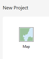 |
|---|
| New project |
4. Name your project file. Save the project file to your own folder for this (your H: drive or Box). Leave the box checked to create a new folder for this project and press OK.
 |
|---|
| Saving to H: drive |
 |
|---|
| Saving to Box |
5. You just created a project file: .aprx. A project file is a file that contains pointers to your data sets (it does not actually save the datasets) and remembers what you had displayed in your session. If you quit ArcGIS Pro at this point, you can reopen this project (by double clicking it) and everything will be as you left it; the same data layers will be there and it will have the same view of the data. Thus, project files are easy ways to save work.
But beware – project files do not actually contain data! They only have pointers to where the data is saved. If you copied your ArcGISPro_IndiaBasics.aprx file and tried to open it on a different computer without also saving the data layers, the ArcGIS Pro session would start and list the data in the Contents (also sometimes referred to as Table of Contents in previous versions of ArcGIS), but nothing would appear because it would not be able to find the where the data is stored. A little red exclamation point would appear in the Contents, informing you that it has lost the connection to the data.
Save your project file frequently and always save at the end of a session. ArcGIS Pro likes to crash!
Opening Catalog, and adding data layers
1. Once your project opens, you should be able to see a topographic map on ArcGIS Pro. If not, go to the top menu then, Insert → New Map.
2. On the right side, there should be a Catalog window. This is like a file manager for GIS data. If this doesn’t show up, you can go to the top menu and then click View → Catalog Pane.
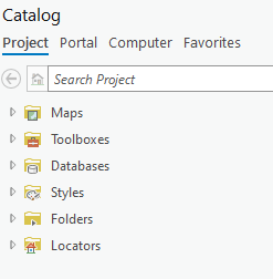 |
|---|
| The Catalog pane |
3. You can click on the Auto-Hide icon (thumbtack) to hide this window (this is helpful when you need to see more of your map). Click on the icon again to keep the window in place.
 |
|---|
| Hide and reveal the Catalog pane by clicking the thumbtack icon |
4. Click to expand Folders. You should already have your folder for your project file in here. If not, right-click Folders and then select Add Folder Connection. This will allow you to access the files for your data.
5. Click on Computer and navigate to the folder where you saved the data for this exercise (extracted from the zip file IndiaBaseMap). For example, you could have saved it to a folder in Box as shown in the screenshots or you could add a connection the data in your H: drive or in the S: drive.
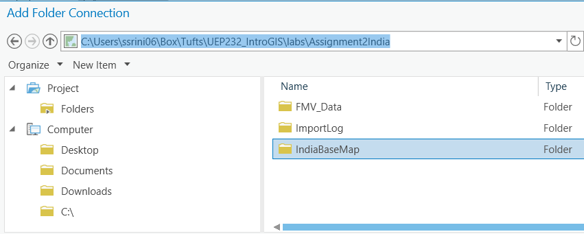 |
|---|
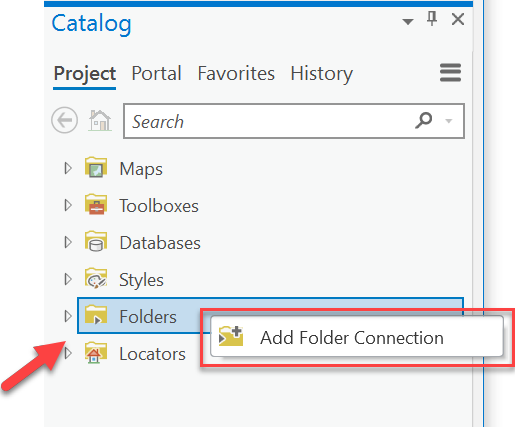 |
| Adding a folder connection |
6. In the Catalog if you expand the folder for this exercise, you should see a connection to the data.
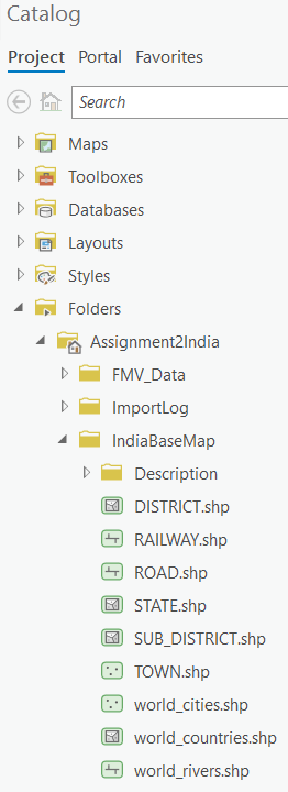 |
|---|
| The expanded catalog window |
7. Click once on each shapefile to highlight it and drag the data layers into the main ArcGIS Pro window. You can also hold Shift and click on the first and last file to highlight all drag it into your map. Drag in all the layers with name beginning with world_ (cities, countries, and rivers)
8. Uncheck layers in the Contents if you don’t want to see them. You can do so by clicking once on the box, located to the left of the file name.
Getting Around the Map Menu
Make sure the Map menu is active
1. Zoom into a part of Africa using the Zoom In tool  or the scroll wheel on your mouse.
2. Use the Navigation tools to move around the map.
 |
|---|
| Navigation pane |
- Use Explore to pan
- Use Bookmarks to save where you are on the map to come back to
- You can return to a previous extent you were at on the map using these arrows:

- Use the Zoom to Full Extent to go back to the full view which encompasses all the data.

Note: In ArcGIS, you can place the cursor over each tool in the menu without clicking to see a description of what it does.
3. Select the Explore  tool and try clicking on countries, rivers, or cities (in the map). This highlights the polygon, line, or point depending on the data and brings up information from the “attribute table” for each feature you click on.
NOTE: Knowing how to use the Attribute table is a very important part of building your skills in geospatial research. It behaves similarly to a spreadsheet,
4. Can you find Gulu, Uganda?
Hint: Choose the Locate
tool. You can type in Gulu Uganda in the search bar—there will be several options that come up. Right-click on the first option and select Zoom To so that you’re brought to Gulu.
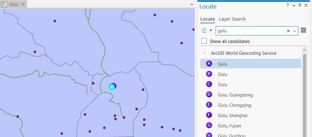 |
|---|
| View of Gulu |
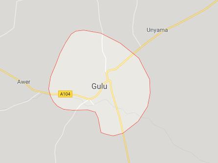
Technically all these Gulus are correct—even though its shown as a point on our map, Gulu as a city has an area, and thus is technically a polygon when properly zoomed using Google Maps:
 |
|---|
| Gulu on Google Maps |
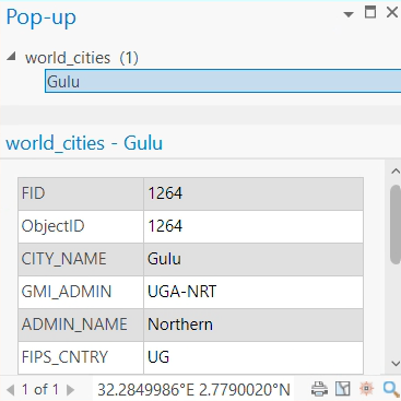
You can see our point for Gulu from the cities layer is located near these points. Click on the point to check that it is indeed Gulu.
 |
|---|
| Pop-up from clicking on Gulu point |
5. Right-click on the rivers layer in the Contents (be sure you right-click on the actual name and not the symbol) and then click on Label – this will label the rivers.
6. When you are done looking around, click on the full extent icon in the Navigation menu.
 |
|---|
| Navigation pane |
7. Now choose Project → Save Project or Save Project As on the top menu.
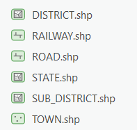
8. Drag in other layers from the IndiaBaseMap folder 
 |
|---|
Other layers from IndiaBaseMap folder |
Note that these layers are only for India. Also note that the map will be messy.
9. Zoom into India so that it fills the map. 
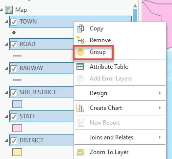
10. You can group the India data layers all together. If they are no longer all highlighted, hold the CTRL key and click on each one in turn to highlight them. When they are all highlighted, right-click on one of them and choose Group as shown below:
 |
|---|
| Group the new layers |
11. Rename the “New Group Layer” to India by clicking slow-clicking twice on the label and typing in India.
 |
|---|
| Rename the grouped layers |
12. Perform the same grouping on the World data layers so that it is in its own group. If you click on the first and last datasets, while holding shift, all layers will get highlighted and you can group them faster.
13. Turn off the World data group.
REMINDER: Save your map project file frequently and always save it at the end of a session!
Setting a Coordinate System for the Map Frame
The rest of this tutorial focuses on India, so we are going to set a coordinate system that better maps India. This will also ensure that any spatial queries you do will perform correctly. We will talk a lot more about projections soon in the course.
1. Right-click on Click on Map in Drawing Order and choose Properties.
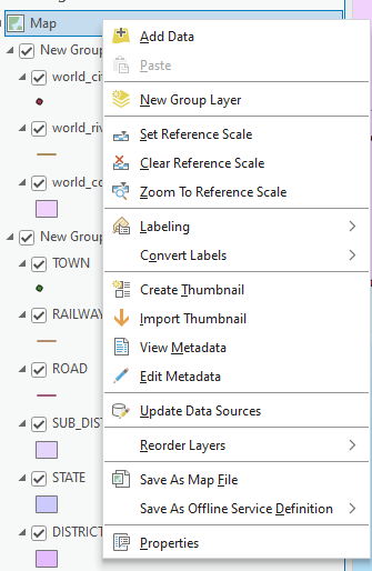 |
|---|
| Select properties |
2. Click on the Coordinate System tab.
3. In the coordinate system dialog box, you will see information in the bottom panel for the current coordinate system (GCS_WGS_1984).
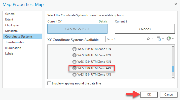 |
|---|
| Coordinate systems |
We want to change this.
4. Scroll down and click on Projected Coordinate Systems, then UTM then on WGS 1984, then Northern Hemisphere, and finally on WGS 1984 UTM Zone 44N as shown below and then OK.
5. Turn on the world data and zoom to the full extent  . You will see that this severely distorts the rest of the world. But it’s a great way to map India!
6. Zoom back to India when you’re ready and again turn off the world data by unchecking it.
7. To clean up the map, uncheck all the layers except for the railway, district, and state layers within the India Group.
Defining the General and Symbology Properties for a Layer
In this section of the tutorial, you will learn how to organize your data layers' properties to start bringing some coherence to the map. You will also learn how to color the data layers to start making a more interesting and readable map.
Assigning Proper Layer Names
First, you need to give the layers better names than what they have (e.g., SUB_DISTRICT → "Sub-district").
-
Right click on the SUB_DISTRICT layer and choose Properties (alternatively, you can click twice slowly on the data layer name).
-
When you see the Properties dialog box, click on the General tab and for layer name, type in Sub-district instead of SUB_DISTRICT. Press OK when finished.
Note: this does not change the name of the original data set - it only changes the name as it appears in this Project Session (.aprx) of ArcGIS Pro and as it will appear on your final map.
-
Rename all the layers so they are not in all caps.
In the future, points will be deducted on assignments for having non-standard “data speak” names like
cntry08appearing in your map. Renaming layers with human-readable titles as you go is an important way to avoid this mistake.
Assigning Proper Colors
Your map would be a lot better if the district layer were not blocking the state layer, etc. We want the State boundaries to show up on top of the District boundaries.
-
Right-click on the State layer and select Symbology.
-
To change the color of the layer, click on the colored box next to Symbol - this should bring up Symbol Gallery box.
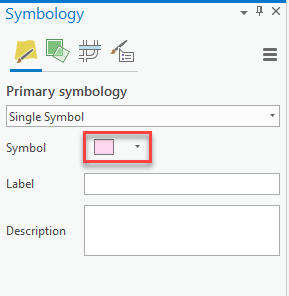
Fiddling with symbology -
Click on the Properties tab. Select No Color and make the outline width
2 pt. Give the outline a dark gray color.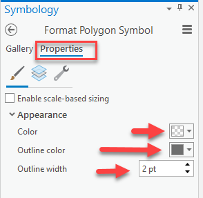
Fiddling with symbology Note: You can also access this by clicking on the symbol underneath the layer name in Drawing Order.

-
Press Apply when you are finished.
-
Drag the State layer to the top of the India group in Contents. Now that it is hollow you can see the layers underneath.
-
Color the District layer beige and give it a
1 ptgray outline width as shown. Using what you have learned, give appropriate colors to your other layers.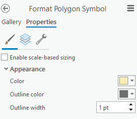
Applying symbology to District layer -
When finished, choose File → Save again. Now your project file will remember all the colors and names you assigned. It’s starting to look better…
Drawing a Layer Based on an Attribute Value
Some of your layers would look better if you could distinguish between types of features within the same layer. The State layer, for example, shows India’s state boundaries but doesn’t give us more information when drawn with a single color. You can use an attribute field to symbolize your data to reflect the field values.
-
If it’s not already on, turn on the State layer (a layer is “on” when its box is checked).
-
Right-click on the State layer and choose Open Attribute Table.
-
Before we proceed, you need to know what the items in the attribute tables for the STATE, DISTRICT, and TOWN attribute tables mean. The attribute table contains relevant information about the states, but the field headings (aka column headings) are sometimes hard to understand.
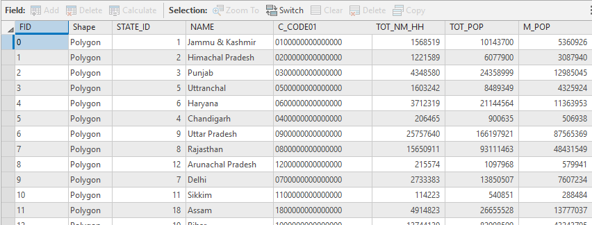
The attribute table Metadata is documentation explaining what is in your attribute table and gives a definition for each of the field headings. To know what attribute fields are appropriate for use in symbolizing your data, you must be familiar with the attribute table structure, its fields, and the possible values of each significant field.
-
Using Windows File Explorer – not the folder connection in ArcGIS Pro – navigate to the
IndiaBaseMapfolder. There is a subfolder calledDESCRIPTION. Open this folder using your Windows File Explorer. Read throughState.pdfto see what the abbreviations in the attribute table columns mean.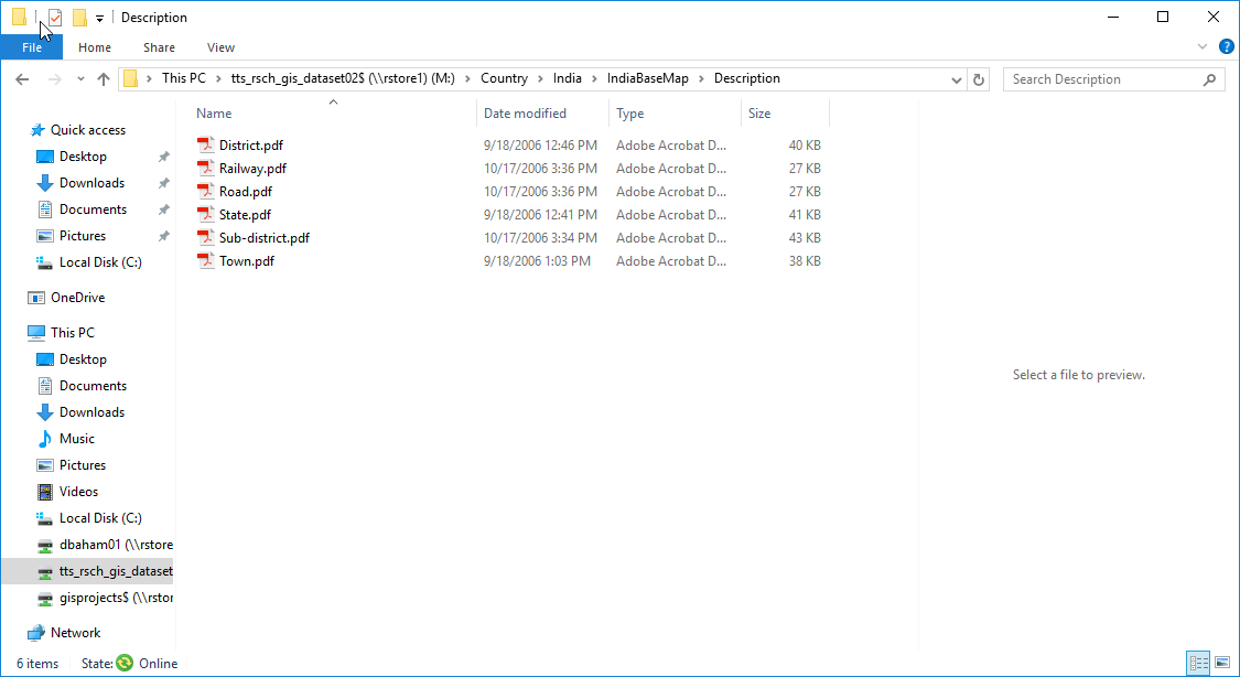
Contents of DESCRIPTIONsubfolder - Let’s say we wanted to visualize the population of cultivators. We see that the field name for this data item is TOT_CULT and that the number of Total Workers is in the field, TOT_W.
-
Right click on the State layer and click Symbology.
-
Under Primary Symbology, select Graduated Colors.
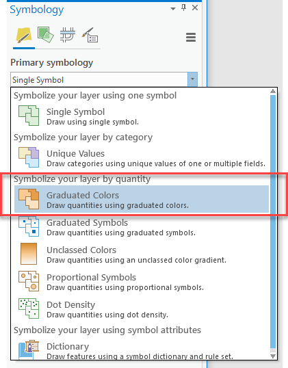
Graduated colors in primary symbology - Change the drop down next to the Field to be TOT_CULT, as you see below:
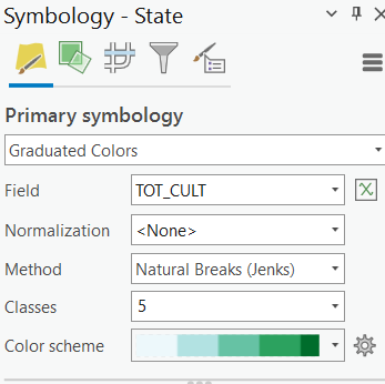
Changing the drop down field -
Notice that the options in the Value dropdown are the field headings you saw in the attribute table. 4. If you can’t see the data, make sure your “World” group of data is turned off.
-
Now, we see the states with larger numbers of cultivators. What states have the largest numbers? Hint: Click on the states to get their information. Make sure you are in the Explore mode

-
-
But now we want to map the states by showing the percentage of cultivators out of the total number of workers. To do this, we need to normalize the data by the Total Workers field.
- Go back to Symbology. In the box for Normalization, choose the field, TOT_W – when you use this Normalize function, it simply divides the top value by the normalization value to give you a fraction, so in this case Total Cultivators/Total Workers = % of Total Cultivators out of the working population.
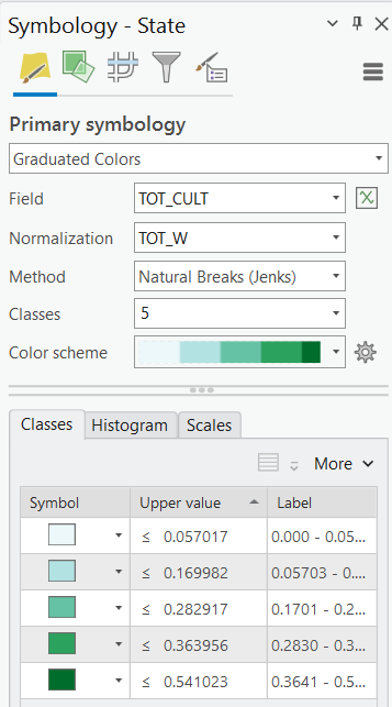
Setting Normalization field to TOT_W - The resulting map shows the number of cultivators in each state as a fraction of the total workers (e.g., 0.541023 means 54% of workers are cultivators).
- Try making the same map (percent of workers who are cultivators) using the District layer instead of State layer. Compare the two layers. You may have to drag one on top of the other to see them.
How would you create a population density map for the District layer (total population divided by area)?
Note: The Tot_Area column is the square kilometers of the district. The State and Sub_district layers do not have a Tot_Area column!
- Try creating other maps based on the attribute table values by State, District, or Sub-District – the field (column) names in the attribute table are the same for all of these. Save your project file when finished.
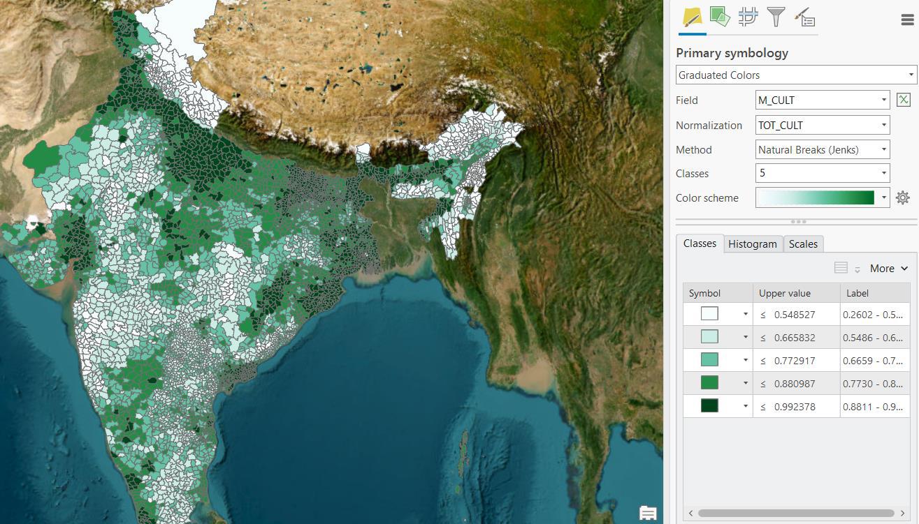 |
|---|
| Male cultivation across India |
Tip: If you want to keep a layer symbolized one way (e.g., percent cultivators for each state) and also have another map by state (e.g., percent illiterate), you can add the State layer again from ArcCatalog and start fresh on the new layer.
- Assign a proper title to the layers you symbolize. Change the heading name (eg. TOT_CULT/TOT_W) to Percent of Cultivators. Leave the layer name as District. You can change the heading name by clicking twice slowly on the heading or by pressing
F2when it is highlighted.
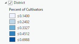 |
|---|
| Changing title of layers |
Selecting and Mapping the Largest Cities in India (optional)
In this section, we’ll use the Town layer which includes all of India’s towns to select and map only the towns that have a population greater than 1 million people.
1. Turn on (checkmark) the Town layer. Drag Town to the top of the group in the Contents.
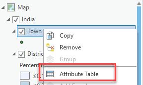
2. Right-click on the Town layer and choose Open Attribute Table
| |:—:
|:—:
3. Scroll to the right in the table until you see the TOT_POP field:
| |:—:
|:—:
4. We’re going to use this field to select all the towns in India with 1 million or greater total population.
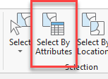
5. Go to the top menu, click on the Map tab and click on Select by Attributes.
 |
|---|
| Select by attributes tool |
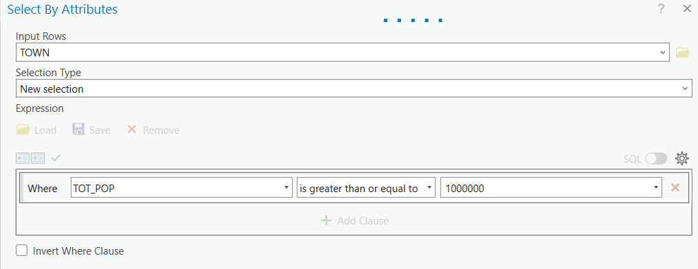
5. In the query box, make sure Input Rows is Town and Selection Type is New Selection. In the query box, use the drop down box to select TOT_POP is Greater than or equal to and then type in 1000000. Click OK when done.
 |
|---|
| Interface for Select by attributes |
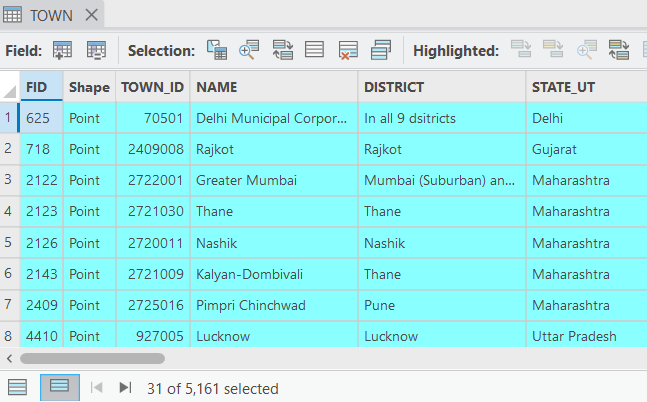
6. You should have 31 towns selected. It should say “31 out of 5161 Selected” at the bottom of the table after highlighting the rows:
 |
|---|
7. Close the table. You should see the over 1 million towns highlighted in blue on your map.
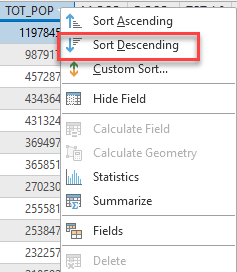
Tip: Another way to select these towns is to manually select the total town populations. You can right-click on the TOT_POP to select Sort Descending and highlight the towns less than 1000 million.
9. To create a layer with just these large towns, right-click on Town and the choose Data → Export Features:
 |
|---|
| Interface for Select by attributes |
10. You’ll get a new dialogue box like so. Click on the folder next to Output feature Class to choose where you will save this layer. Navigate to your folder for this exercise → ArcGISPro_IndiaBasics and within the GDB or geodatabase – a database structure that should automatically be created when you save a new project – name the new layer Large_cities. Then click OK. Alternatively, you can also save it in the folder as a shapefile as Large_cities.shp.
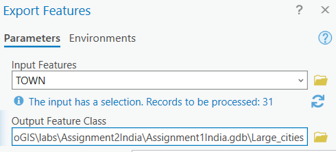 |
|---|
| Exporting as feature class to GDB |
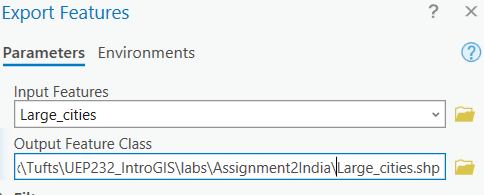 |
|---|
| Exporting as shapefile to folder |
11. Once added, change the name from Large_Cities to Large Cities (remove the underscore).
12. Drag the Large Cities layer into the India group so that they are at the top of that group. Turn off the Town layer, so you only see the Large Cities.
13. Click on the Clear icon to turn off your original selected towns. This is located in the Selection group under the Map tab on the top menu bar (it is only grayed out if nothing is currently selected).
 |
|---|
14. To display the large cities with symbols graduated by population size, right click on the layer and select Symbology.
15. Fill out the symbology properties as you see below. You want a map showing Quantities using Graduated Symbols, using the TOT_POP field as your value:
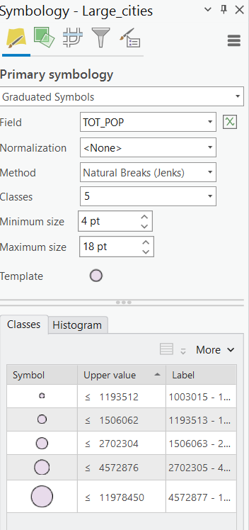 |
|---|
| Setting graduated symbols |
16. Now, turn the full Town layer back on. Using the complete Town layer, create a graduated symbol map of total population using the steps outlined above for Large Cities. You’ll see it’s quite messy when looking at all of India but provides better visual information when you zoom into one state. Zoom into a state to see what we mean. You might need to turn off the other layers to see the State Layer.
To return to your last “extent” or view, press the back button.
 |
|---|
If you want to change the colors of the symbols, in the Symbology properties box, above the symbol window, right-click on the layer to go to Symbology. Click on the symbol in Template then go to the properties tab.
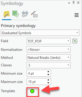 |
|---|
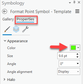 |
| Changing the colors of symbols |
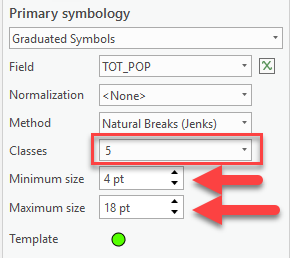
Tip: You can also change the number of “classes” or break values, by changing the box that says Classes.
Click on the back button to return to primary symbology.
 |
|---|
You can also change the starting/ending size of the symbols in the boxes immediately above the symbol window, as shown in the screenshot.
 |
|---|
| Change start and end sizes |
Save your project file!
Selecting Towns by their location relative to Railroads (optional)
Let’s say we wanted to see which towns in India have sufficient access to railroads and which towns do not, and we want to estimate the population in each group. You can use the Select by Location function to select features based on their spatial relationship to other layers.
1. Turn on the Town layer and the Railway layer. Pull Railway to the top of the India Group in the Contents.
2. Click on Selection → Select by Location on the top menu.
 |
|---|
| Select by location |
3. Fill out the dialog box as you see below and press OK when finished:
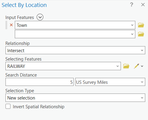 |
|---|
| Select by location |
4. You’ll see that most towns are within 5 miles of a railroad. How many people live within these selected towns? Let’s find out.
5. Right-click on the Towns layer and choose Open Attribute Table.
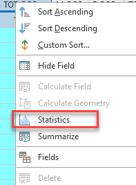
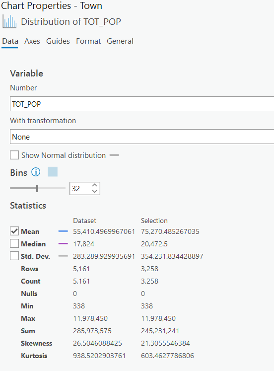
6. You will see several records are selected. Scroll to the Tot_Pop field and right click on its field name and choose Statistics as shown below:
 |
|---|
 |
| Statistics tool |
7. When the chart properties pop up you will see descriptive statistics for the selected features, including a “sum” value of about 245 million people on the side panel. That’s our answer! But how many people don’t live in a town within 5 miles of a railroad?
8. Close the Statistics box. Click on the Switch Selection Icon at the top of the attribute table:

9. All the towns that were not selected before are now selected – these are towns that are greater than 5 miles from a railroad. Right-click on the Tot_Pop column to get the statistics for this group – you should see the sum is around 40 million people.
You see that the Statistics function gives you descriptive statistics for the selected features. If no features are selected, it gives you descriptive statistics for the entire set of features. You can click on the selection again in Filter to deselect –

– or you go back to the table or the table tab, and you can clear the selection of Town.  .
.
10. Close the statistics, clear your selection  , and close the attribute table.
Labeling a Layer Based on an Attribute Field
You can label features based on attribute values. Let’s label the States.
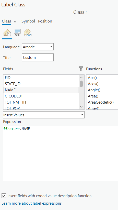
1. Right-click on the State Layer and choose Label. It should automatically populate with the appropriate state names. If it doesn’t, right-click again on State and select Labelling Properties. If the Expression box doesn’t say $feature.NAME, erase whatever’s in the box. Find Name in Field and double-click it to populate the Expression box. Click Apply.
 |
|---|
| Label by field |
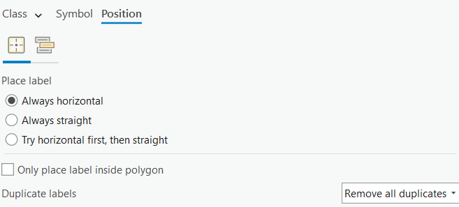
2. Note that the names for some states are repeated – that’s because the state may have islands or other non-contiguous sections that are represented twice in the database, and so get double names. To get rid of the double names, right-click on the State layer and click on labelling properties.
3. Click on Position then then select Remove all duplicate from the drop down for Duplicate labels.
 |
|---|
| Changing position of labels |
Changing the Formatting of Labels
Let’s say you want to have the State names stand out more on the map. We can do this by changing the label’s format.
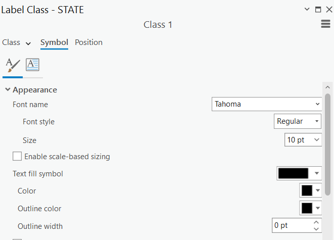
1. If you aren’t already in Labelling Properties right-click on state and select the option. Go to Symbol tab and then to Appearance.
 |
|---|
| Change symbol appearance |
2. You can choose the font, size and color of your labels here. Pick weight (e.g., bold) font (e.g., Calibri), and size (e.g., 10pt) settings that feel right to you, and click on Apply.
3. If you don’t like the results, adjust the label format again as you wish. Check out some of the predefined label styles.
Using Data from ArcGIS Online (optional)
ESRI and other agencies are hosting online GIS data servers that you can access from ArcGIS Pro. We’re going to use one of these streaming layers now. Make sure you are signed in and don’t see the “Not signed in” message:

If you do, you might need to sign in using the browser (the ArcGIS organization name is tuftsgis):

1. We’re going to change our base map. In the Catalog panel, Go to Portal and then click on Living Atlas  .
.
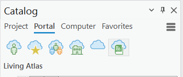 |
|---|
| Esri’s Living Atlas |
2. Move the World Imagery layer to the bottom of your Contents.
3. Remove your original Basemap at the bottom of the Contents. To remove a data set you don’t want, right click on the data layer main name (e.g., Basemap) and choose Remove.
4. If you don’t remove it, turn off the layer for now. It makes drawing very slow. You can choose this base map or keep the original World Topographic Map, it depends on you.
Measuring Distance and Area and Drawing a Map to Scale
Measuring distances and areas
1. Click on the Measure tool in the Main toolbar under Map.

2. Click somewhere on the map to start a measuring line. Drag the line somewhere else and click again. You will see two measurements reported in the Measurement window.
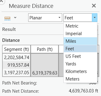 |
|---|
| Measure distance |
The first, segment, gives the distance of the line you just drew. The second, Path, gives the total distance. Click on a third point in the map and make another line segment. Every new line you create, the tool sections off segment and path for each of your different lines. Sum gives the total distance of all your different lines. Double-click on the map to stop measuring.
Note: If you want to measure in a different unit, select a new distance unit.
Drawing a map at a set scale
Many professional map users expect printed maps to be at a standardized scale. USGS topographic maps are printed at 1:100,000 scale (1 inch on the map equals 100,000 inches in the real world or about 1.58 miles) and at 1:24,000 scale for example (1 inch on the map equals 24,000 inches in the real world, or 2000 feet or about 0.38 miles). In ArcGIS you can scale your map to any scale, but you are also offered standard scales from which to choose.
1. Set the scale of your map to 1:10,000. The scale is located on the bottom left of the map next to the Catalog.
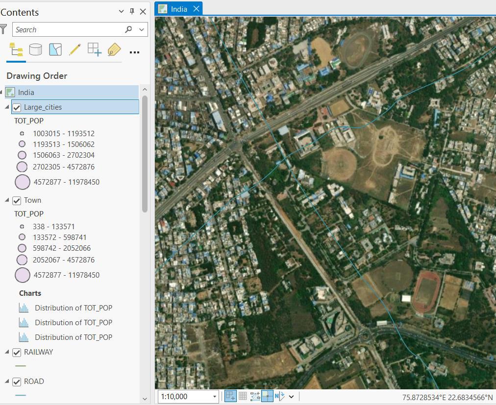 |
|---|
| Set scale of map |
This is very “large-scale” map (lots of detail, small area displayed) so it would work well for a map of a city but not for a map of a state or the entire country.
Note: It can be easy to confuse “large” and “small” scale. Remember, large scale means you see less detail, while small scale means you see more detail.
2. Experiment with some of the other map scales. Which scale would be good for a map for the entire country or one state? You can also type in a scale yourself (you only have to type the denominator, e.g, 24,000, with or without commas).
These are unitless scales. 1:24,000 means that one unit on the map (or your computer screen) equals 24,000 of those same units in the real world. The scales provided are standard paper map scales in the United States. 1:24,000 is the map scale of the USGS topographic quadrangle maps (sometimes known as 7.5 minute maps because they cover 7.5 minutes of latitude and longitude).
3. Try typing in 150,000 in the scale box – this creates a map at 1:150,000 scale (1 inch on the map equals 150,000 inches in the real world).
Creating a Layout for Printing or Graphic Export
To create a printable map, you will use the layout view. It is a paper view of your data, much like viewing the page layout when you are working in a word processing software. You should use the layout view when you are ready to create a map – do all the preliminary work and analysis in the data view (where you have been up to now in this tutorial).
In this tutorial, you can create a map of all or any part of India you like.
When you create a map, you could include:
- The map itself
- A descriptive title
- A legend
- A scale bar (in kilometers for international data)
- A north arrow
- Name of the cartographer (e.g., you)
- The Date & Class
- Acknowledgements of data sources
It is important not to include too much information in a map layout. You would not want a map that includes all the data layers you have in your ArcGIS Pro session from this tutorial. It would be much better to do several separate layout maps.
You may also include other elements on your map – for example, more explanatory text, labels, charts, tables, photos, or other images.
Note that you can also have more than one map frame on a layout – for example, you can have a small locational reference map, or an inset map to show an area in more detail or situate your detailed map in a larger context.
For detailed information about layouts, go to online to ArcGIS Pro Layout: https://pro.arcgis.com/en/pro-app/help/layouts/layouts-in-arcgis-pro.htm
Setting up a Map Layout
1. Before you start a map layout, it is important to think through what you want to do and how you want your map to look. What do you want to show? How large do you want your final map to be? Portrait or landscape orientation? Do you need space for additional text or graphics? This tutorial example will assume a printer paper size (8x11 inches) map but often you are making map for publications where they must be smaller, or for Powerpoint where they need to be a certain size (e.g., 7.5x10 inches), or for posters where they may be much larger than 8x11 inches.
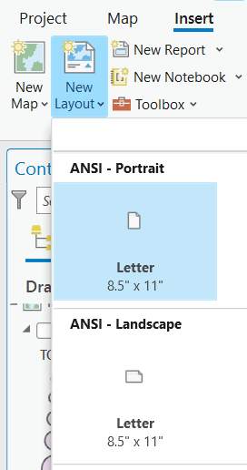 |
|---|
| Make a new layout |
2. In the Main Menu Bar, choose Insert → New Layout and choose Letter 8”x11.5” either Landscape or Portrait (which would be better for the map you want to create? The example map is in Portrait orientation).
3. The view changes to show your map frame on a page layout and a new toolbar appears – the Layout toolbar.
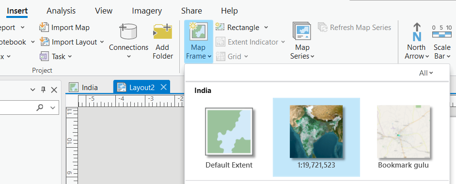
4. Go to the main menu bar Insert → Map Frame and select the symbolized map
 |
|---|
| Make a new layout |
5. Then draw a box onto the layout, and fit as much as possible onto the layout. The map you selected will draw within the extent that you drew in the layout
Moving Around in the Page and Map Frame
6. It is very important to understand the difference between the Layout –

– and the Map. To be able to move around in your Map (not Layout), click on your map  **.
**.

This will change the menu so you can zoom in and out of your map using the scrolling wheel or Explore tool in Map and click to pan around.
Resizing and Moving the Map Frame
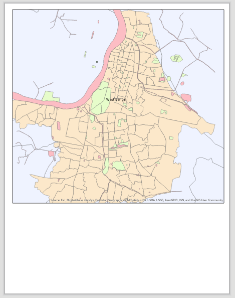
You will always need to re-size things in your map, especially the map frame itself which contains the map image. In this case we are moving and resizing our map frame so that it fills the 4/5ths of our page (as shown below). We’ll then put a title, legend, and other map requirements in the blank space along the bottom of the page:
Moving and re-sizing in ArcGIS Pro works similarly to most other programs where you use graphics. The key is selecting the element first. The steps for this are on the next page.
1. To resize and move the map frame, use the Select pointer under the Layout view to select the frame.
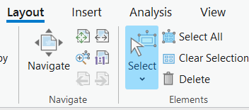 |
|---|
| Select pointer |
2. Use the small grab points on the corners and sides to resize.
3. Click and drag with the cursor anywhere over the map frame to move it.
 |
|---|
The Map Frame is the black frame that directly borders the geographic information on the map itself. The Paper Outline is the 8/5x11 sheet behind it. |
Inserting a Title, North Arrow, Scale Bar and Legend
A title, north arrow, scale bar, and legend are all important elements of a map. You access them by going to the Insert item on the Main menu bar.
You can read more about these at https://pro.arcgis.com/en/pro-app/help/layouts/layouts-in-arcgis-pro.htm and then scrolling down to Related Topics about adding elements to your map.
 |
|---|
| Options to add north arrow, scale bar, and legend |
1. Use the Insert menu function to insert a North Arrow. Draw a space for it in the layout. Place it in the bottom, empty part of your map layout initially.
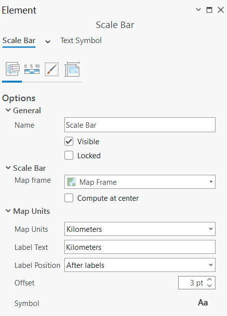
2. Insert a scale bar of your choice. You may wish to change the units of the scale bar you select. If you want a different unit, double-click on the scale bar. A new window shows up. In the Map Units section, select a different Division Unit. You can size the scale bar using the corner nodes. Make sure it ends on an even and easy to read number (eg. 4 Km instead of 4.5 Km).
 |
|---|
| Select scale bar units |
Only three countries in the world use the imperial system (e.g.,
inches,feet,miles) to measure distance. Be sure to useKilometersfor international data!

3. There are lots of ways to improve your Legend. For starters, let’s say we’re creating a map of Larger Cities in India. We want the legend and map to focus on large cities. To control what goes on the legend:
-
Choose Insert → Legend from the main menu and click and draw on the layout to create small box for the legend.
-
Adjust what is in the legend so that only Large Cities is there by following the graphic below. Click on the legend so that the Format Legend panel shows up on the right.
-
In the Contents/Drawing Order for your map layers, unselect every layer except Large Cities.
Note: make sure Large Cities is checked in the Contents in your Map, or else the legend will be blank.
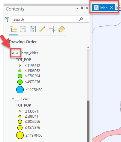
Select scale bar units -
Go back to your Layout view, click on your legend again to access its properties. For Title, type in Cities Population.
-
You can change its properties (font, size, etc) by clicking on Text Symbol → Appearance:
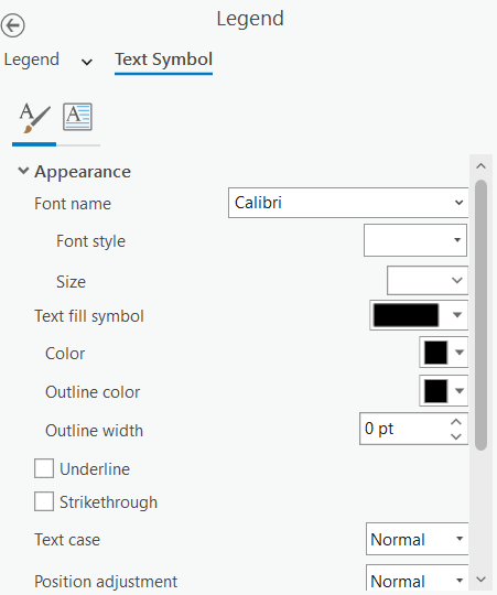
Changing font appearance of legend -
There are lots of things you can edit in the Show Properties. Explore the different tabs to see all the options.
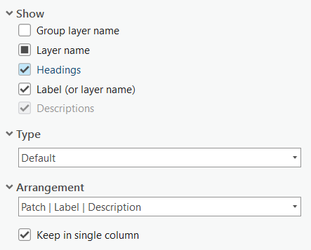
Select scale bar units
Selecting Elements
You can select more than one element by holding down the Shift key as you click on each element.
Modifying an element after insertion
You can usually modify an element after you have inserted it by selecting it and then double-clicking on it. The relevant dialog box will appear for that element (e.g. legend, scale bar).
Inserting text
1. To include the title, your name as the cartographer, and any other information, use the Insert tab on the Main menu and select the style of text for a title. Remember also to include text for date. You should also have a data source. Note that the data comes from the Tufts GIS M Drive (For later tutorials, it will need to be more specific).
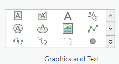 |
|---|
Select the A in the top-left corner |
2. Add more text for any more descriptions or explanation of your map. 
3. You can change font properties on selected text by right-clicking on the selected text and choosing Properties and then changing the font name in Text Symbol.
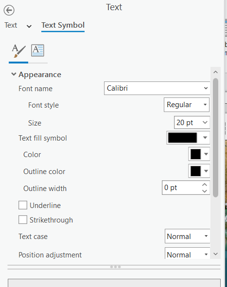 |
|---|
| Add more text and change appearance |
Inserting a Picture
Note that you can also insert images into the map frame using the Insert tab and then going to the Graphics group.
 |
|---|
| Select the image icon in the second row |
Deleting and Trying Again
If modifying an existing element doesn’t work, remember that you can always select an item and delete it if you don’t like it. You can right-click on it and press delete. Especially useful if your legend gets messed up – just delete and insert a new legend again to start fresh.
Adding a Second Map Frame to Show an Inset Map
You can add a second (or more) map frame to your ArcGIS Pro session. This can be handy for putting in a small "locator" map.
Adding a Second Map Frame for a Locator Map
In this example, we’ll use a new map frame to insert a locator map.
1. In Layout View, choose Insert → New Map from the top main menu. A new map will appear on the top tab. Click on this new tab and rename the map frame to Inset Map by clicking on the Frame in Drawing Order twice slowly.
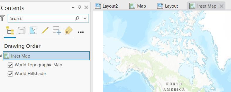 |
|---|
| Preparing your project for a locator map |
2. Go back to your layout view and click on Insert. Insert another map frame in your lay out—click on the current extent for your new inset map.
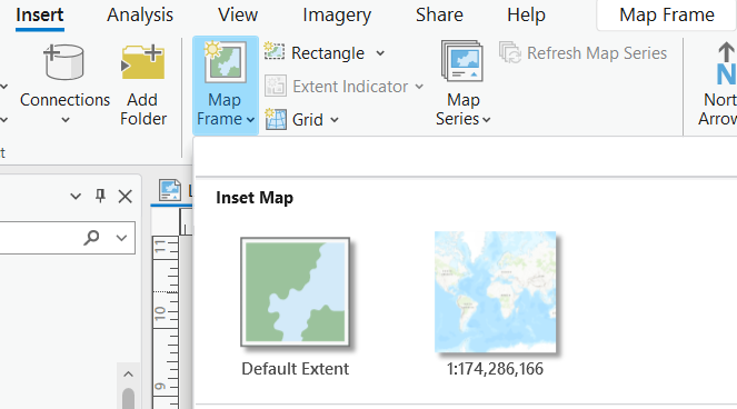 |
|---|
| Add a map frame |
3. Move and resize the new map frame box so it is in the location you want it – here we are taking it to the bottom right corner of our layout.
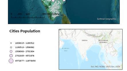 |
|---|
| Moving the new frame |
4. You can add data to this map just as you did to the first one. In the Contents, you can drag a layer from the Catalog. You can also copy from another Map frame: right click on the Countries layer from the original frame (Map Frame) and select copy. Right-click on the second map frame (Inset Map) and click paste. Make sure to turn on the new layer so it is visible.
5. Also drag the State layer (in your India group layer) in the Inset map frame.
6. Zoom closer to India in the map frame.
7. Make sure to drag the state boundaries above the Countries. Countries should be white with a gray outline.
8. Set the State fill color of your choice but with no outline so you will highlight India boundaries and not the state boundaries.
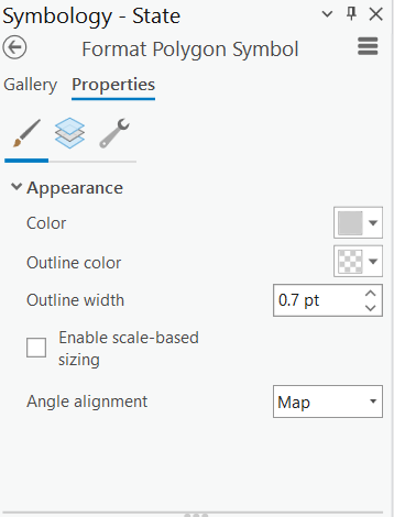 |
|---|
| Change state color |
9. Get rid of the distracting service layer text by clicking on Insert on the main menu then Dynamic Text.
 |
|---|
| Dynamic text |
Scroll down to the Layout section and select Service Layer Credits. Draw a box anywhere on the layout so that the service layer credits become its own text box. Drag the text box over to the edge of the layout.
 |
|---|
| Dynamic text |
When you export your layout, the service layer credits will not show up in your final exported map.
Setting up Locator Map Boundary Box (optional)
Finally, we’re going to show a boundary box on our Locator or Inset Map.
1. Select your inset map using the select tool.

2. Go to the Insert tab and select Extent Indicator in Map Frames group.

3. If you want to change the size and color of your extent indicator, in the Contents/Drawing Order, right-click on the extent indicator layer underneath Map Frame 2 and select Properties.
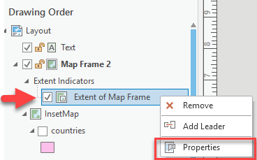
4. In the new panel, make sure the source is set to the original Map Frame (just known as “Map Frame” here). Click on the boxed symbol, and go to Properties to change the size and color.
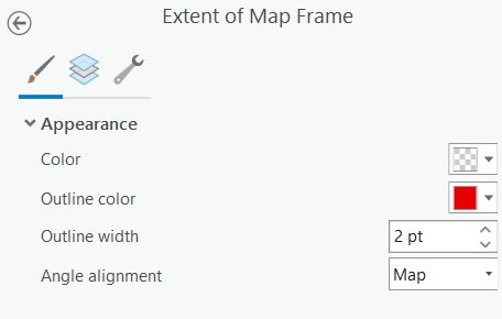
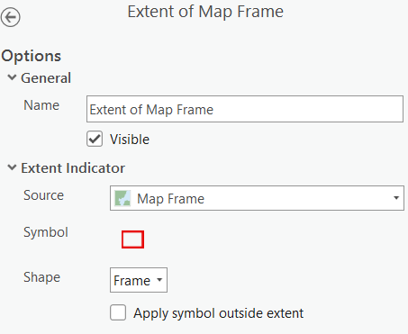
Printing or Exporting your Map
You can print directly from ArcGIS Pro or you can export to a digital graphic format like .pdf. Printing works just like any other Windows program, so we won’t cover that here, but feel free to print your map.
The ability to export to a digital format is very useful. If exporting to an image, remember to set your page size to the appropriate dimensions - this may mean custom dimensions, e.g., a small image to fit on a computer screen, a powerpoint presentation, a web site, or word document. When creating a layout for digital export, you should think ahead about what size you want your final image and lay out the map accordingly and be sure to use font sizes that are readable at the final map size.
-
When you have your layout the way you want it, choose Share → Layout Export.
-
In the Export dialog box that appears, navigate to your tutorial folder and give the image a name.
-
For Save as Type, choose a format - we recommend .gif or .png or .pdf because they come out well and are readable across a variety of platforms. The only problem with PDF formats is that they do not import well into Microsoft publisher and they do not recognize all text fonts.
-
Before you export, adjust the Resolution (the units are dots per inch, or DPI) to
72. Digital images meant to be seen on a computer screen do not need high resolution:72 DPIis the optimal value for screens, and beyond that, you’re just wasting space.300 DPI– which should be the maximum you ever choose is necessary for small-format printed maps. -
Press Export when you are ready to go. The process will take a minute.
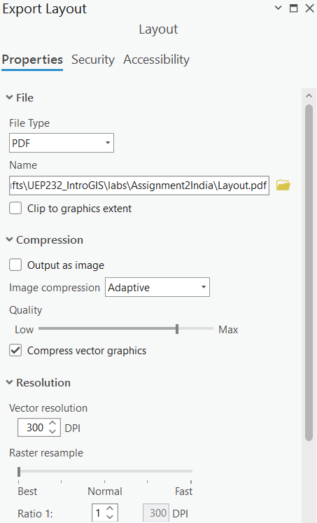
Note: You must be in layout view to export your layout. If you’re in map view, you’ll just export your map instead.
- Check your results by navigating to the folder outside of ArcGIS and opening the graphic.
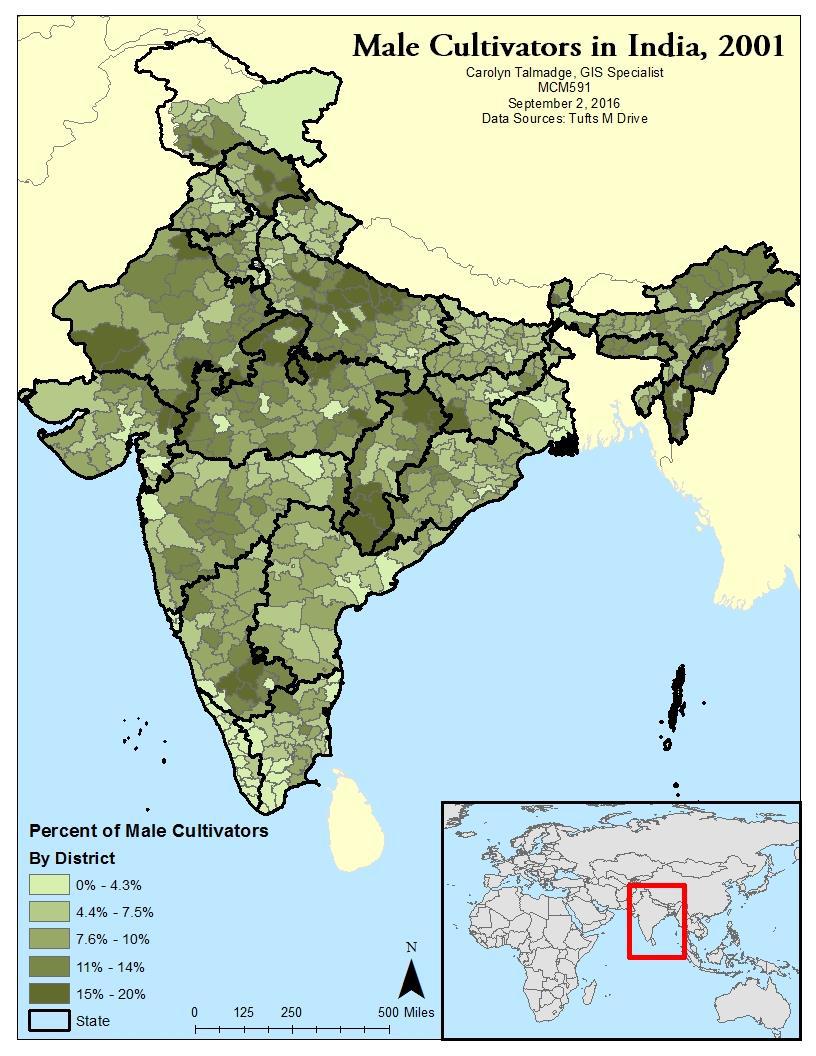
Deliverables
Submit a copy of your completed map via Canvas in .png format by Tuesday 1/30 at 6:30pm.


